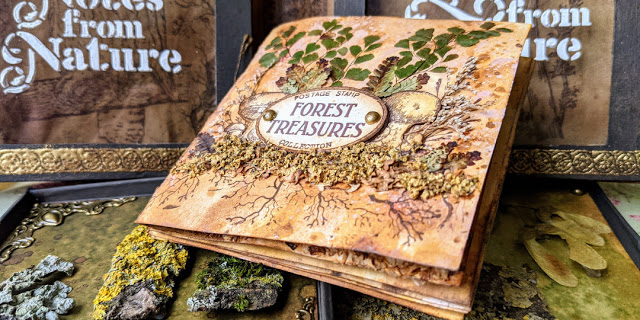
Hi everyone! I’m really thrilled to share this project with you today! I’ve created this for the current topic at PaperArtsy blog: Nature’s Treasure. Despite its small size it was a huge project, perhaps too ambitious, but the topic deserved it!
As you know (and as you may have seen from my latest release) I love nature, so this topic was the perfect opportunity to create something beautiful to use and display those many collected treasures that I’ve been finding and saving (or hoarding) in boxes for a long time. I love them! My precious… [she said with a Gollum voice… LOL].
I wanted to create something that could display some specimens as they are, because they are already beautiful and I just wanted to preserve them and admire them later. And at the same time I wanted to use some of those treasures as embellishments to enhance and add textures to my art pieces, so I came up with this idea: I would create some sort of cabinet (or mini jewellery box) with a pair of drawers that I could remove and I would store a mini art journal in the middle. My idea was to fill the art journal as well for today, but I had to limit myself to just one spread because I didn’t have more time, but I’ll share with you what ideas I have in mind for the rest of the journal pages.
Hi everyone! I’m so happy to share with you my new release of stamps and stencils with PaperArtsy on January 2018 (now available at my Etsy Shop). I’ve gone Nautical Vintage this time, with 3 stamp sets and coordinating stencils about the sea. I’ve also made 3 videos for this release. Go and find them in the blog post. Let me know what you think in the section comments below 😉 Enjoy!
Hola a todos! Estoy muy contenta de compartir con vosotros mis tres nuevos sets de sellos y estenciles (ya disponibles en mi tienda Etsy) que he diseñado para PaperArtsy. Esta es una release marinera de estilo vintage. He hecho 3 videos que podéis ver en el post más abajo. Ya me diréis qué os parece en la sección de comentarios 😉 Espero que os gusten!
Hi everyone! Today I bring you my very first Art Journal page, inspired by the Art ‘n Soul Studio October Challenge which is called Tree of Life. For me the Tree of life can be any tree, which means life itself and it’s also home to other things that live around it, in this case, mushrooms and snails. Search for Art ‘n Soul Studio in Facebook if you want to join the group for mixed media inspiration. Let me know what you think in the section comments below 😉 Enjoy the post and the videos! One short and one long, the extended version for those of you who have more time and want to see all the details.
Hola a todos! Hoy comparto con vosotros mi primer Art Journal inspirado por el reto de octubre de Art ‘n Soul Studio que se llama Tree of Life, el Árbol de la Vida (os podéis apuntar al grupo en Facebook). Para mí cualquier árbol representa vida en sí mismo y da hogar a que vivan otras cosas a su alrededor, como setas o caracoles, en este caso. Ya me diréis qué os parece en la sección de comentarios de abajo 😉 Espero que os guste el post y los vídeos! He hecho uno “corto” y otro versión extendida para quienes estén aburridos y se hayan quedado con ganas de ver todos los detalles.
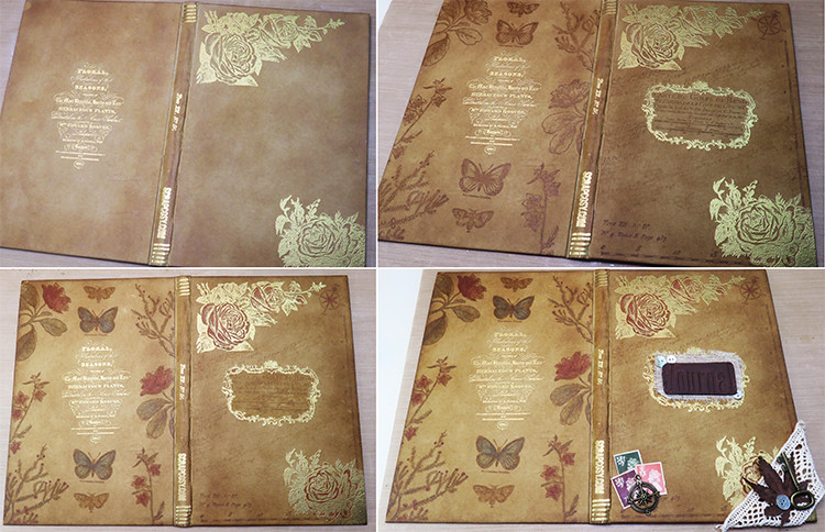
Hi everyone! Today I’m bringing you my latest project made for the PaperArtsy Challenge on Topic 11 which is about books: a Vintage Art Journal Book bound by me! I used some signatures of an old book for the inside pages while I decorated the outside using some of my scrapcosy stamps (ESC03 – Voyager and ESC04 – Vintage Roses) which I coloured using Infusions and I created some DIY embellishments. There is a video with all the details! And you can also see this Project in the PaperArtsy blog.
Hola a todos! Hoy os traigo mi proyecto más reciente que he creado para el reto de PaperArtsy Topic 11- Books : Un cuaderno para Art Journal encuadernado por mí! He utilizado un par de pliegos de un libro antiguo que serán las páginas de mi Art Journal y he decorado las portadas usando algunos de mis sellos, las colecciones ESC03 – Voyager y ESC04 – Vintage Roses. He pintado las imágenes estampadas con Infusions y lo he decorado con algunos adornos hechos por mí. Hay un vídeo con todos los detalles más abajo!
It’s been a while since I wanted to start an Art Journal and when the topic 11 in PaperArtsy blog was introduced, it was the perfect excuse to create one from scratch, specially since I’m now a fan of binding things! My binding techniques come from me applying (un)common sense learned from nowhere and everywhere and experimenting with materials and sizes. So far I think I’ve succeeded. My best friends on this subject are grey card stock, kraft paper and mod podge. If you have those, you can bind anything in any format! See my video below for full details, but before let’s see some pictures and details of this project! I hope you like it! 🙂
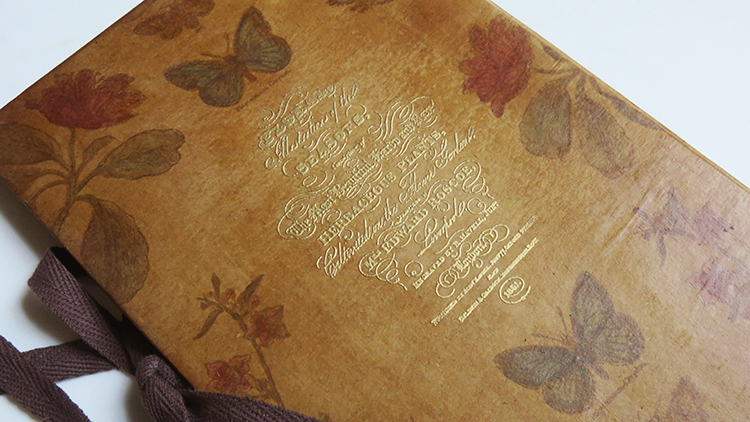
And this is the inside, where you can see the vintage pages of the book which I plan to partially cover with paint or gesso, so I start my art journals with a nice and faded background:
When I started the project I just knew I wanted to create an art journal in vintage look, so I went and created a brown base (kraft colour) using 2 pieces of grey card stock, an A3 paper and lots of mod podge. And I choose to work with ESC03 (Voyager) and ESC04 (Vintage Roses) mainly and I also used the handwritten text from ESC06 (Halloween)
ESC03
From there I decided roughly my composition and started stamping in Vintage Sepia Ink and embossing some parts in gold. Then of course I added some colour with Infusions and finally I added some embellishments at the end. So here you can see how the project evolved:
Almost everybody reading this knows how to stamp and emboss (otherwise, check the video), so I’ll just highlight the later steps. To add some colour I went for a selection of “muted tones” of Infusions and mixed them with Matt Glaze Fresco Finish so I create my own translucent paint: Olive Tree, Golden Sands, Sunset Beach and Sleight Blue, and I have to say that these colours (plus Rusty Car, which I didn’t use this time) are my most favourite ones! LOVE THEM SO MUCH! God bless you PaperArtsy to bring us such colours into the world!!
The back remained simple, just coloured stamp images. I Really like how ESC03 and ESC04 work so well together. And I feel using just Olive tree and Sunset beach for all the flowers and plants and stamping each image twice and in different places makes my composition balanced and that hint of Sleight blue in the butterfly just makes a pop. I don’t know why but in most of the cases I end up liking more the back sides I make rather than the front ones!
At this point my back cover was done and I decided that the front one was too flat and lacked interest in comparison… I couldn’t let that happen, poor front cover! So I decided to add some 3D layers on it, and I did that by creating 3 clusters: the Journal title, the postal stamps and the weirdo corner.
Let’s start with the simplest one, the postal stamps: I basically grabbed 3 UK postal stamps that coordinated in colour with my covers and sew a metallic compass on top of them (I prefer to sew rather than glue my non-paper embellishments if I can, and if it’s a metallic piece, I like to use a minimum of three stitches, to make sure it doesn’t move), then I glued the composition with mod podge on the surface.
Then, the weirdo corner just happened by itself: I had a little broken drawer from an advent calendar (no more than 2 by 2.5 inches in size) and I had few things in there, among them some buttons, a piece of lace, a metallic key, the postal stamps and a maple leaf from Japan. While I was getting my postal stamps for the previous cluster, the leaf and the key landed on the project and I thought: OK, they have chosen to be there! So I added other bits and pieces from the same drawer and there you go, a corner created by itself!
And finallythe Journal title. I had planned 2 version for the titles, one stamped and embossed, the one shown before and then an alternative version consisting of stamping my frame in modelling paste and then stamp my title “Journal” on it, but since I still liked the gold embossed frame of the cover, I decided to use both ideas together, so I cut the piece of clay to a rectangle with the word Journal, painted it with Chocolate Pudding Fresco Paint and then applied some Treasure Gold Onyxite, then I glued it in a piece of fabric where I sew few buttons and added some fiber underneath to create like a nest.
And now it’s movie time, so grab a cup of tea or some popcorn and enjoy watching how I made the whole thing with all the details:
I really enjoyed binding my own Art Journal and decorating the outside! Now it will be time to feed it with some art and put that book spine to work and expand! I’m really happy with the colour selection of infusions I used, specially the touch of the blue in the butterflies. I feel that just using Olive tree and Sunset beach for all the flowers and plants made the whole composition to hang together. And I love how these 2 stamp sets work so well together!
You should try creating your Art Journal Book too, instead of buying a brand new one, no need to start binding if you don’t dare yet, just grab an old book, paint the covers with some acrylic paint and you will have your plain surface to stamp on and to decorate. Then for the inside, glue some pages together to get some thickness and partially cover the letters with light paint or gesso, that will give you a nice faded background to start. That is what I plan to do on mine 🙂 And if you see that your art journals tend to become bulky because you stick too many layers and 3D elements, remove some pages from the book in between each project, so you make some room. Also consider adding a lace to close it down or an elastic band like moleskine notebooks have. Or even better, attach a padlock mechanism, to get a more romantic/vintage feeling book, which only you can open with a key. Actually, that would be a nice “secret diary” present that you can handmade and give to someone special, a daughter, a niece, a bestie, you name it! If you have other ideas, share them in a comment below, I would love to read them and I’m sure we will all get inspired by you!
I hope you liked it! Thanks for reading! And see you soon! 🙂 If you want to send any comments or subscribe, go to the end of the post below
CUADERNO ART JOURNAL
Hace algún tiempo que me rondaba la idea de empezar un Art Journal y cuando salió el nuevo reto de PaperArtsy Topic 11 (que va de libros) me pareció la excusa perfecta para crearme un cuaderno de cero para poder luego usarlo a tal propósito. Últimamente me he enganchado a encuadernar cosas, jeje. Mis técnicas de encuadernación son inventadas, nacidas de la observación y de mi (sin)sentido común, y por ahora parece que me han funcionado. Mis mejores amigos para esta tarea son el cartón gris, el papel color craft y la cola Mod Podge a mansalva. Con ellos puedes encuadernar lo que quieras en cualquier formato y tamaño. Al final del post tenéis el vídeo con todos los detalles, pero antes, vamos a verlo en fotos. Espero que os guste! 🙂
Y este es el interior, que tiene las hojas de libro antiguo. Mi idea es cubrir parcialmente las letras con pintura o gesso y dejar que se entrevean un poco para así empezar mis art journals con un fondo difuminado.
Cuando empecé el proyecto lo único que sabía era que quería crear un cuaderno para mis Art Journals en estilo vintage, así que por eso me creé una base de color marrón kraft, utilizando dos trozos de cartón gris forrados con un papel A3 de ese color y mucho Mod Podge. A partir de ahí decidí trabajar principalmente con mis sellosESC03 (Voyager) y ESC04 (Vintage Roses) y también utilicé el sello del texto de la colección ESC06 (Halloween)
ESC03
Una vez elegidos mis sellos los dispuse encima de la base hasta que tuve clara la disposición, hice una foto y a partir de ahí empecé a hacer embossing de algunas partes y a estampar otras, luego di color con infusions y finalmente añadí detalles a la portada principal. Aquí podéis ver la evolución del proyecto:
Casi todos los que me estaréis leyendo ya sabéis cómo estampar o como hacer un embossing (y si no es así, miraos el vídeo que allí lo explico) así que me centraré en el resto de pasos. Para añadir color seleccioné una paleta de 5 tonos apagados de infusions que es mi favorita: Olive Tree, Golden Sands, Sunset Beach, Sleight Blue y Rusty Car (este último al final no lo usé). Qué maravilla de colores! ME ENCANTAN TANTO!! Gracias PaperArtsy por crearlos y traerlos al mundo!! Si mezclas infusions con una glaze o barniz consigues crear tu propia pintura translúcida como ya he explicado en casos anteriores en YouTube. En este caso usé Matte Glaze de PaperArtsy que da un acabado mate.
La contraportada la dejé sencilla, solo sellos estampados y coloreados. Me encanta lo bien que quedan las colecciones ESC03 y ESC04 juntas. Y creo que el hecho de haber elegido solo dos colores (Olive tree y Sunset beach) para todas las flores y plantas y haber estampado cada diseño dos veces y en sitios distintos, hace que mi composición quede equilibrada. Y el toque de Sleight blue en las mariposas le da vida. No sé por qué pero muchas veces me acaban gustando más mis contraportadas que mis portadas…
Una vez la parte de atrás estaba lista y al volver a mi portada principal, esta me pareció aburrida en comparación, le faltaba interés y volumen… eso no podía ser, pobre portada no se iba a quedar así de sosa! Así que decidí añadir detallitos en tres grupos distintos: los sellos postales, la esquina estrambótica y el título Journal.
Empezamos con el más fácil: la esquina de los sellos postales. Para hacerla seleccioné 3 sellos en colores que coordinasen con la paleta original, los envejecí con tinta distress Vintage Photo y les cosí una brújula metálica. Cuando añado decoraciones que no son de papel, si se puede, me gusta coserlas por dos motivos: (1) no me fío de que el pegamento las mantenga en su sitio y (2) al añadir hilo o tela o puntilla, le estoy añadiendo calidez (y aire vintage) a mi diseño y eso me encanta! Y si la pieza a incorporar es un elemento metálico entonces me aseguro de darle un mínimo de 3 puntadas para que no se me mueva (a no ser que el propósito es que quede como un elemento interactivo…). Una vez cosido, pegué la composición a la tapa con mod podge.
La esquina estrambótica surgió de casualidad. En mi escritorio, que está lleno de cosas, tengo por ahí un cajoncito roto y enano (de 4,5cm por 5cm por 4,5cm) de un calendario de Adviento en el que acaban todas las decoraciones que quedaron perdidas y sueltas por encima de la mesa al acabar algún proyecto, por ejemplo, si saco 20 sellos postales encima de la mesa y me olvido de guardar uno, pues cuando reaparece al recoger se va al cajón, lo mismo con botones, etc. Pues cuando estaba rebuscando para sacar los sellos postales y la brújula, tuve que sacar una puntilla y cayeron esa hoja (que me traje de Japón) y la llave encima de las tapas, y pensé: Ah, si? Pues ahí se van a quedar! Cosí el botón encima de la hoja y a la puntilla, también cosí la llave y con pegamento de caliente y luego mod podge, los dejé en su sitio.
Y finalmente, el título Journal. Pensé dos opciones para el título, una era la versión estampada y embossing de las tapas que ya habéis visto y la otra versión era estampar el marco en pasta de modelar, “borrar” las letras de dentro del marco y alisar la pasta para volver a estampar mi título “Journal” en medio (es el sello Tall Text de Tim Holtz). Al final opté por hacer una mezcla de las dos. Cogí la pasta de modelar y la recorté en forma de rectángulo, la pinté con pintura acrílica marrón y luego le apliqué Treasure Gold Onyxite (metallic wax). Por otro lado cogí un trocito de tela (me lo dio mi amiga Aida y por fin lo estrené!) le cosí los tres botones, le pegué unas cuantas hebras con cinta washi por detrás de la tela para hacer como un nido y la pegué con cola caliente al centro del marco dorado de la tapa y encima pegué el título “Journal”. Al final el nidito quedó muy mono, no creéis?
Y finalmente, porque un vídeo vale más que mil palabras, aquí tenéis el paso a paso de todo:
Me ha encantado crearme mi propio Art Journal y decorar las tapas! Ahora me tocará llenarlo de proyectos bonitos y hacerlo crecer!
Animaos a crear vuestro propio cuaderno de Art journal en lugar de comprar uno nuevo. No hace falta que encuadernéis de cero como yo, sólo os hace falta un libro viejo que ya no queráis, le pintáis las tapas con pintura acrílica y ya tenéis una base en la que estampar y decorar. Y para las páginas de dentro, si son muy delgadas, podéis pegar dos o tres juntas para darles más grosor y cubrirlas parcialmente con gesso o pintura de forma que aún se vean las letras y de esta forma no os tendréis que enfrentar a la página en blanco. Eso es lo que yo planeo hacer con el mío. Y si veis que vuestro libro tiende a engordarse por la cantidad de capas de vuestros proyectos, quitadle hojas al libro entre proyecto y proyecto para que el lomo no sufra tanto y se pueda cerrar. También le podéis incorporar una cinta para cerrarlo como el mío (con un lazo) o una goma como con las libretas moleskine, o mejor aún un candado a modo de diario secreto del que sólo tú tienes la llave. Ese sería un buen regalo hecho a mano para alguien que quiera escribir un diario. Se os ocurre algo más? Contadlo en los comentarios para que todos nos inspiremos!
Muchas gracias por leer y nos vemos en el siguiente post! Hasta pronto!! 🙂
Hi everyone! On Tuesday 29/11 I had the chance to show the crafty things that I create at a Christmas Market stall I organised at my office (5% of the sales went to charity), and I’m super happy with the experience and the feedback I got from all the people, so I just wanted to share this with you, for all who missed it, so you can have an idea of what happened, what the people saw (including a video of my Book of samples) and also in case you want to organise a stall yourself, I’ll add my checklist of things to be done ahead, during and after and what can be improved for the next time.
Hola a todos! El martes 29/11 tuve la oportunidad de mostrar las cosas artesanas que hago en un puestecito navideño que organicé en mi oficina (el 5% de las ventas fueron a una ONG) y estoy súper contenta con la experiencia y el feedback que tuve de toda la gente, así que quería compartirlo con vosotros, para todos los que no pudieron venir, para que podáis ver qué pasó, qué vio la gente (incluido un vídeo con mi book) y también por si queréis algún día montar un puestecito vosotros os añado mi lista de cosas, a hacer antes, durante y después y qué se puede mejorar para la próxima vez.
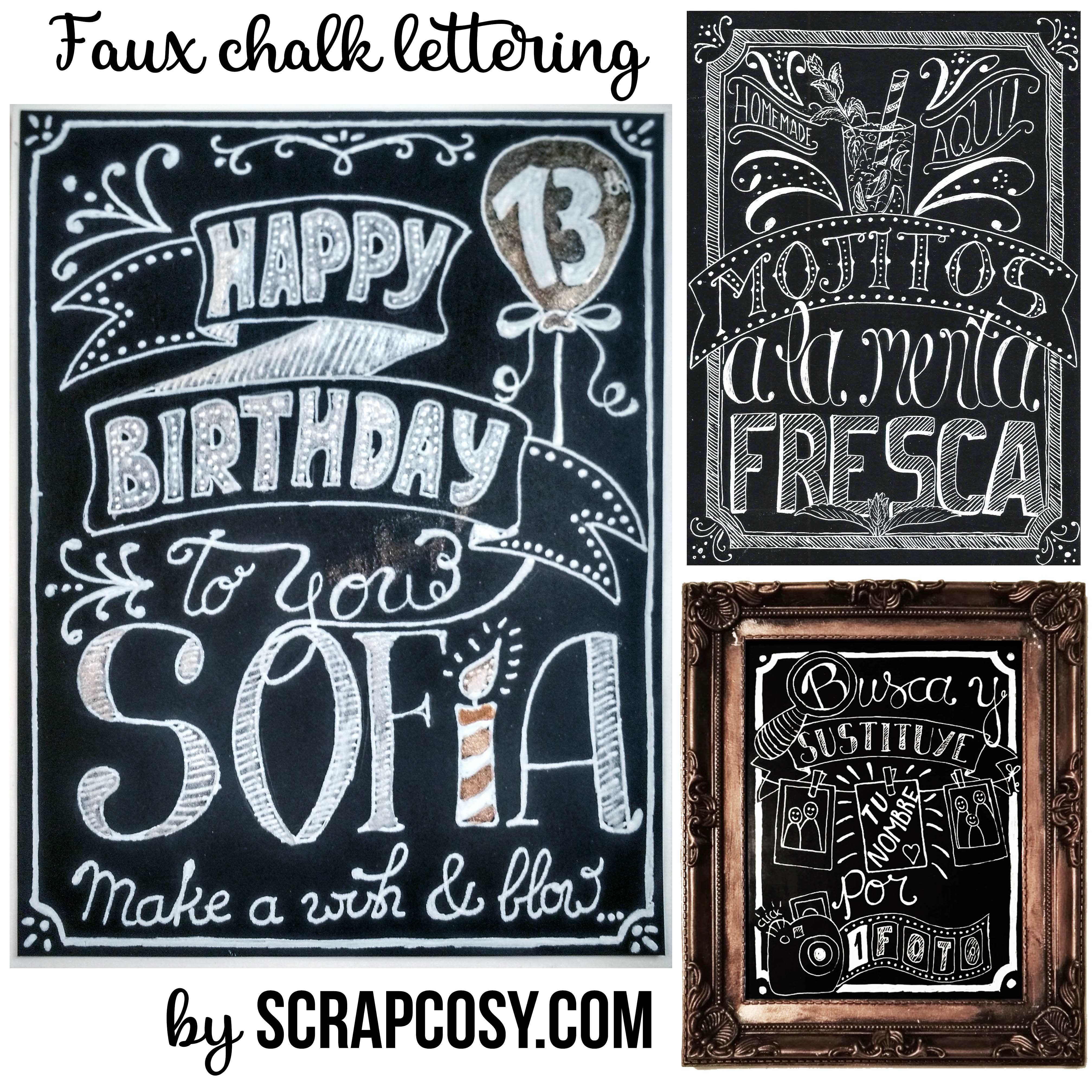
Today I’m sharing with you a card that matched the current fortnight challenge by PaperArtsy, which is about to finish, this time is about typography. I created this card for my cousin Sofía on her 13th birthday and she liked it very much. I also gave her as present the book that trigger it: The Complete Book Of Chalk Lettering, by Valerie McKeehan. I also include other signs that I’ve made using the same technique.
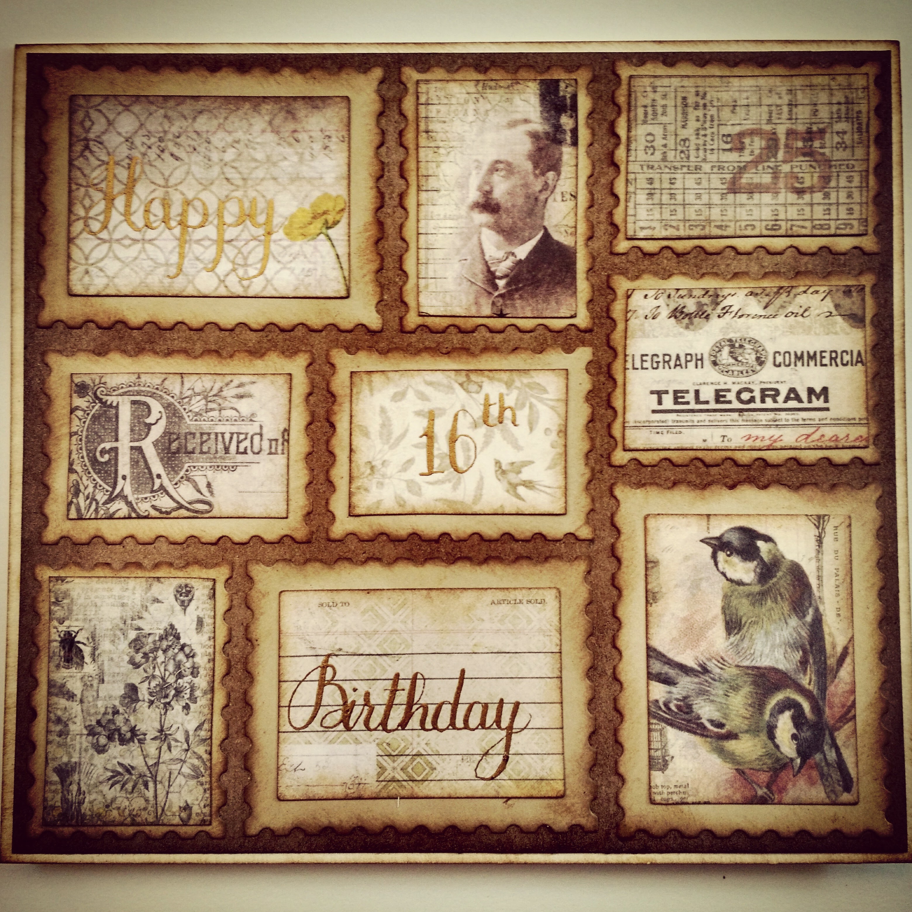
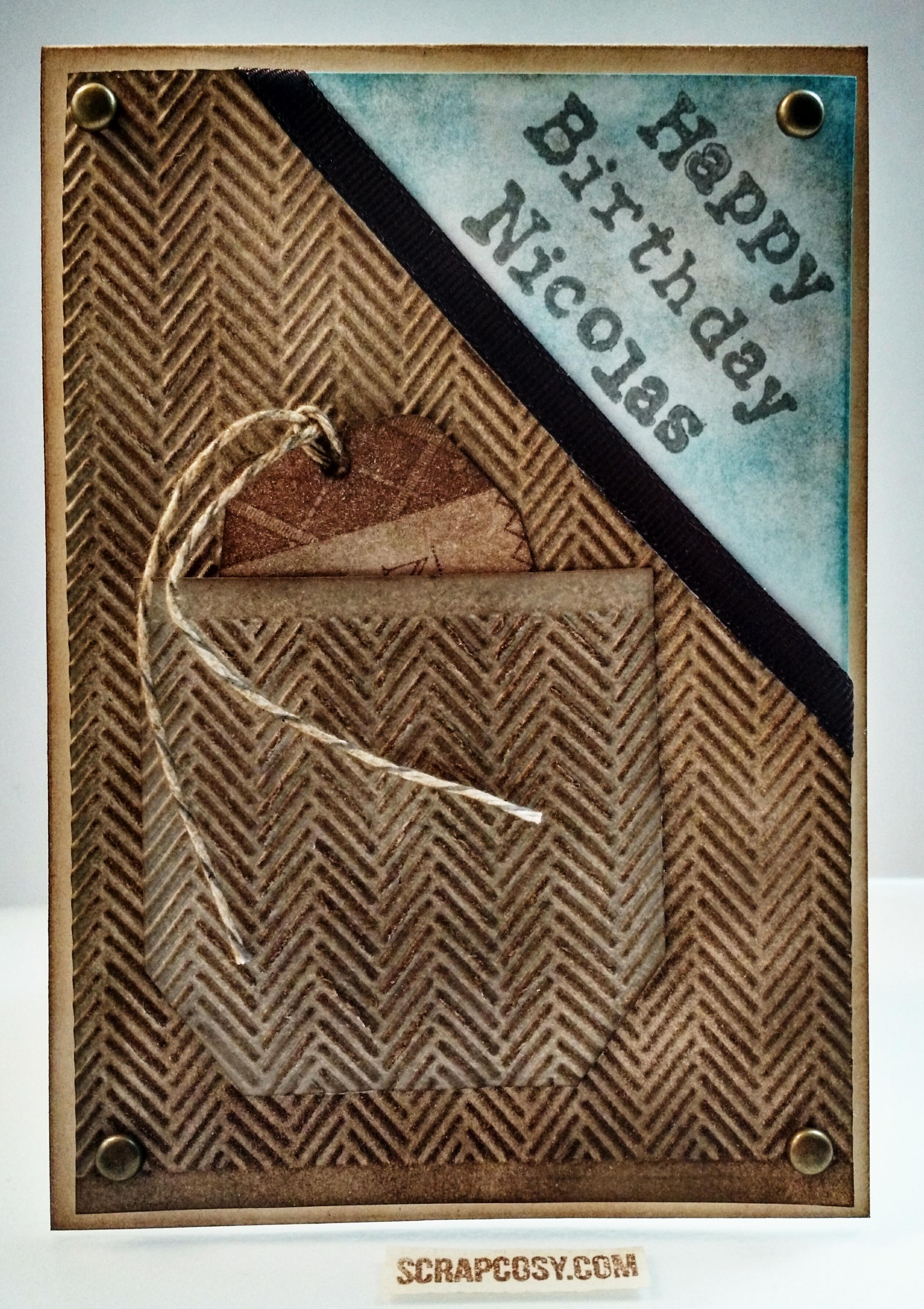
Hi everyone! Today I’ll show you how to create this card inspired by the current fortnight challenge by PaperArtsy, which is squares. My squares, which are actually rectangles, are a mosaic of Postal vintage stamps that I created using a very nice paper collection by Tim Holtz (called wallflower) along with some Sizzix dies (called Postage Stamps). On three of the stamps I’ll be writing my sentiment using a gold ink that I created recently in my previous post and video. This card is for my cousin Alex who will turn 16 in a few day’s time. I hope he doesn’t see the card or the video before his birthday, so shhh, don’t tell him anything! OK? Let’s get started!
Hola a todos! Hoy os traigo como hacer esta postal inspirada por el reto de estas dos semanas que organiza Paperartsy. Esta vez va de cuadrados. Mis cuadrados, que de hecho son rectángulos… van a formar un mosaico de sellos vintage creados con un papel muy bonito de Tim Holtz (se llama Wallflower) y unos troqueles o dies de Sizzix (que se llaman Postage Stamps) con forma de sellos postales, que hacia mucho que quería utilizar. En 3 de ellos aprovecho para escribir a mano usando mi propia tinta dorada una felicitación para mi primo Alex, que cumple 16 en unos días. Espero que no vea el video antes de tiempo así que shhh…, no le digáis nada! Vale? Empezamos!
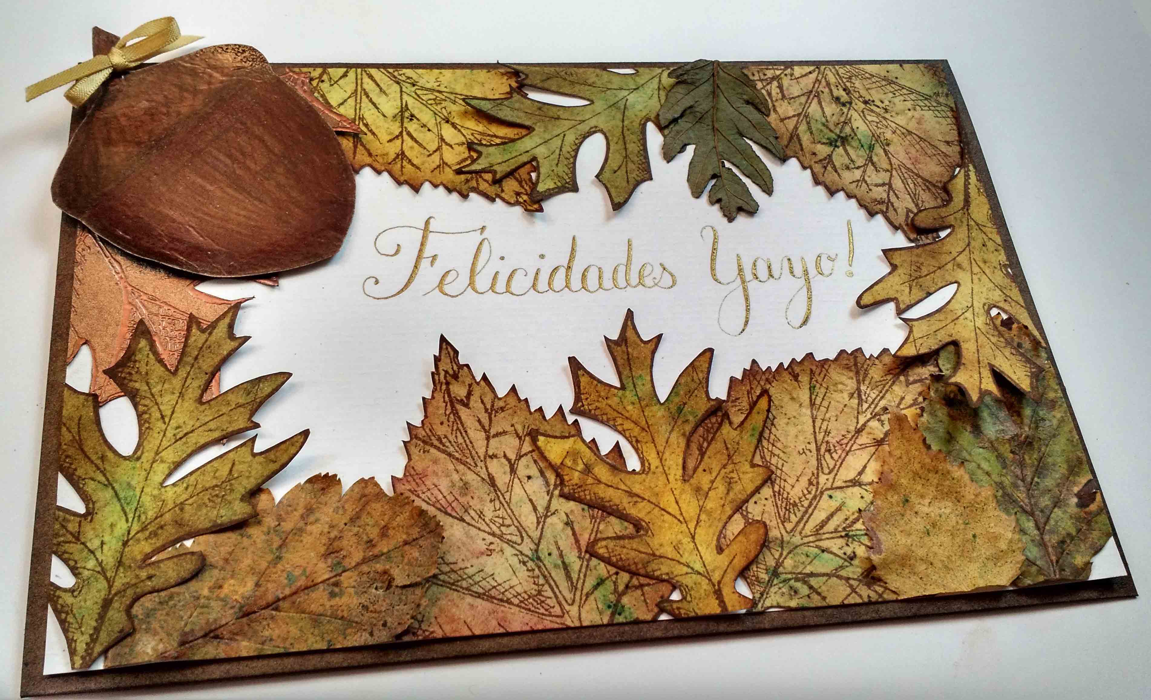
Today I’m sharing with you a card that I just made for my grandpa. I saw the current challenge in Paperartsy blog, which is called Autumn Leaves and I just got inspired and decided that this would be the theme for my grandpa’s card. To create this card I made my own autumn leaves and mixed them with real leaves, I created a nice and shiny acorn and I created my own gold ink, so I can use it for my calligraphy. There is a video with all steps below, just keep reading. Let the glorious autumn begin! 🙂
Hoy comparto con vosotros la tarjeta que le acabo de hacer a mi yayo. Al ver el reto vigente en el blog de PaperArtsy que se llama hojas de otoño me vino la inspiración y elegí usar este tema para la tarjeta de mi abuelo. Para crear esta tarjeta hice mis propias hojas de otoño y las combiné con hojas de verdad, hice una bellota grande y brillante y fabriqué mi propia tinta dorada para aplicarla con la plumilla y hacer un poco de caligrafía. Hay un vídeo con todos los pasos más abajo, sigue leyendo. Que empiece el maravilloso otoño!
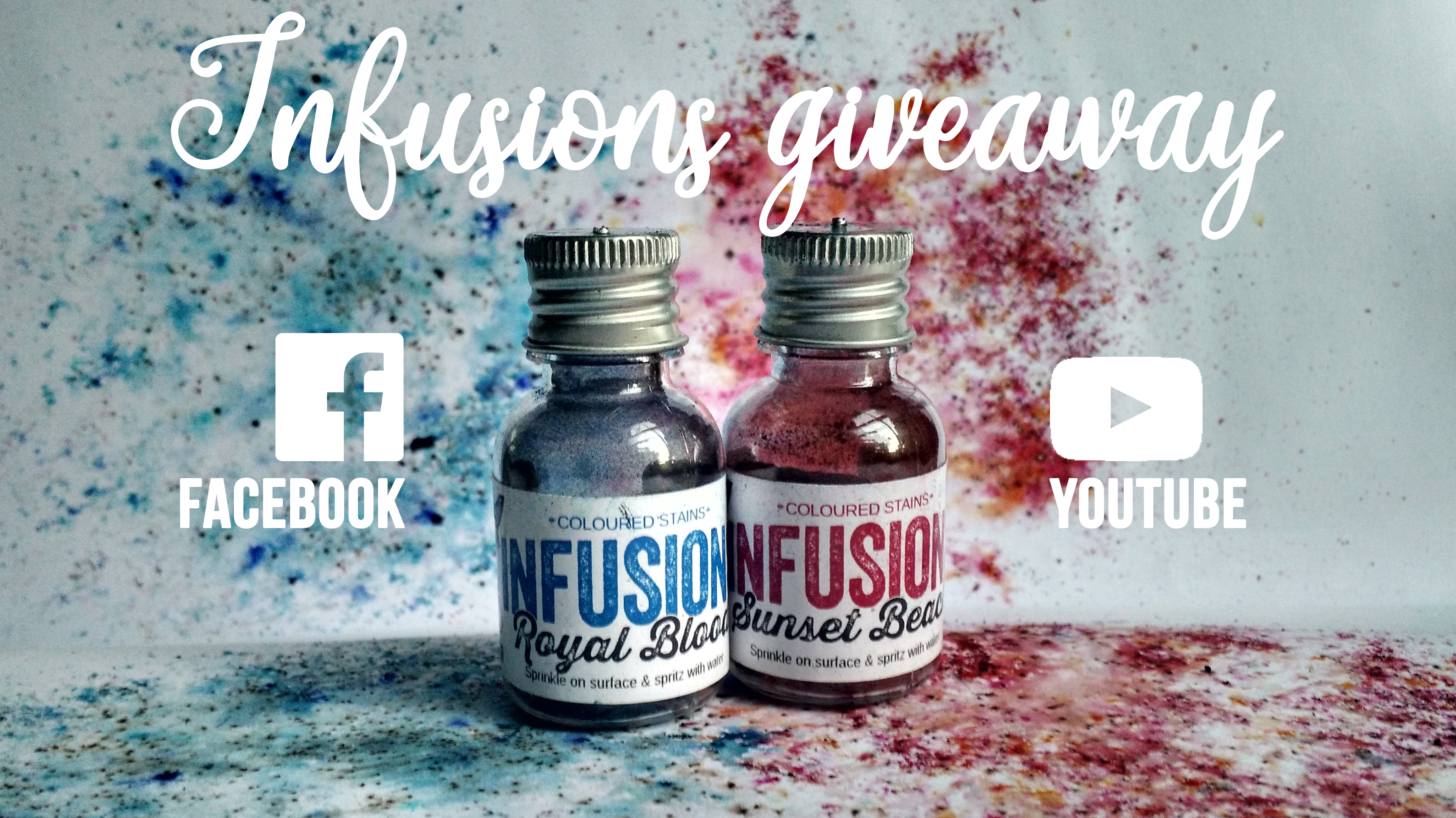
Today we are celebrating one year of scrapcosy! One year of videos and one year of posts, so I’ve decided to create 2 giveaways out of my pocket, delivery included(*), see below for more details and links to the giveaways. And of course, I bring you a new card, specially made for triplets on their 3rd birthday, using Infusions, Distress Inks and watercolour pencils. Let’s play with water!
Hoy estamos de celebración, un año de scrapcosy! Un año de vídeos y de posts, así que he decidido celebrarlo con 2 sorteos financiados por mí, envío incluido (*), detalles y links a los sorteos más abajo. Y por supuesto, os traigo una nueva tarjeta, creada especialmente para unos trillizos en su tercer cumpleaños, donde he utilizado Infusions, Tintas Distress y lápices acuareables. Vamos a jugar con agua!
Hi everyone, I’m very excited to show you today’s post for two reasons: (1) this is the first time that I take part on a challenge, this one is organised by PaperArtsy and the theme is Patterns and (2) in today’s video I’ll use a new song (A children’s game true) that my friend Albert Andreu has created for me, specially for my videos (he is a star! What an artist!) 🙂
Hola a todos! Me hace mucha ilusión compartir con vosotros el post de hoy por dos motivos (1) este es el primer reto en el que participo y está organizado por PaperArtsy, el tema son los patterns (estampados?) y (2) estreno canción en el vídeo de hoy (A children’s game true) que mi amigo Albert Andreu ha creado especialmente para mí, para que pueda usarla en mis vídeos (es un crack! Un pedazo de músico!) 🙂