

I will be in PaperArtsy People at 8:00 (London Time) today to say Hi! and show you my newest stamps and samples, so if you have any questions do drop by or catch the replay!!
If you want to buy these stamps, they are available EXCLUSIVELY from our approved stockists. Check out the list at the bottom of the PaperArtsy post!
Hi everyone! I’m so excited today! It’s (double) release time after such a long pause of… one year! Scary! My next 3 stamps and 3 stencils with PaperArtsy being released today in addition to my very first 3 WOW embossing powders. You may have seen the powders and some of these sample already today in the telly, since my lovely Marion Emberson will have gone to Hochanda and presented these at some point today!
It’s been a tough year for everyone, and in my case I’ve had many things to juggle: my baby Matt becoming a toddler, me and my partner working from home, nursery starting, therefore combining the home-working with babysitting for several weeks, across months (while Matt got used to the many regular nursery viruses…), changing home and on top of that, the pandemic making things even “easier” for everyone… A year with no contact with the rest of our families, our first Christmas in London, lots of Skype and WhatsApp calls to compensate the fact we are far away from each other. It was nice, but I’m hoping this is the last Christmas we spend in this way!
With such a different and so busy year, I didn’t have much time and energy to craft, but I din’t want to give it up completely, so after a long pause of not doing anything at all I found an easy and not very much time consuming activity which helped me starting again. It brought back my mojo and confidence and it still involved getting a bit messy. It was bullet journaling. So for few months I created monthly spreads in different themes (you may have seen them in my Instagram account or even in my scrapcosy Youtube channel). I adapted it my way, in my vintage style and using my beloved infusions, and I’ll show you how, in a video I’ve included today, where you’ll see how I created my January bullet journal setup with the just new released stamps.
Since I loved that much creating my planners and spreads during 2020, I decided that I wanted to have one stamp set and the coordinating stencil just for that, to help me with the bullet journal. So those are ESC21 and PS221 (thanks to Mark to make the names of all products in the release to match! I’m sure it’s not a coincidence… It makes it much easier to remember) I’ll explain more details about these below.
And since we’ve been through a tough year, I wanted to create also stamps that bring people smiles, happiness and, most of all, hope! So people can share and send their creations to friends and spread some well needed happiness. I’ve never chosen a word for the start of a year (I really couldn’t think you can commit to just one word) but this year is different, I can only have one word in my mind which is “Hope”, and while I write this, tears are coming to my eyes… I truly just hope this is over (or really close to an end) and we can all survive and meet again, in person, and hug each other. OK, enough crying! I’ll let 2021 unfold and hope for the best! Don’t give up and stay strong and safe!
And now, let’s see what I’ve designed for this release! I hope you like it! 🙂
New Stamps
Price: RRP €21.92 +VAT
Size:5″ x 6″ (13 x16.5cm)
All stamps are individually trimmed onto cling foam, presented in a clear hanging bag
with a laminated storage/index sheet.
Eclectica³ Scrapcosy Set 21 (ESC21)

This first stamp set ESC21 is what I call “the Bullet Journal stamp set”. As I said before, my only crafting time this past year has been working on my bullet journal. This stamp set and the coordinated stencil are to be used for that purpose, however, you can always use it for other things as you’ll see below. The bottom composition has 3 main purposes: (1) you can use it as a background stamp as it is, (2) you can stamp and fussy cut the words so you can then stick them in your journal or (3) you can cut apart the actual rubber stamp, isolate the numbers or sections of the whole thing into smaller pieces of rubber stamps. This composition comes carefully pre-cut for you (thanks to Mark and Leandra for such an effort when creating the stamps) it hangs together, but if you want to cut it apart, you only need to finish the cutting they started for you. That pre-cutting really helps clumsy people like me, who rush to cut their stamps apart and may make some mistakes and cut more rubber than what was needed (ahem…).
The round, square and oval labels are empty so you can stamp the numbers from the background or you can stencil numbers from the coordinating stencil PS221 below. The rectangular labels were made so the quotes from the stencil PS221 fit but also to fit the months from my old stencil PS071 (numbers in PS071 are also on the same size as the ones in PS221, so you can select the font you like the best).
And in the space left in the small double V banner, you can add any of the words “notes”, “ideas”, “to do” available in the background stamp or any other word (days of the week or months). All fit in! I wasn’t sure if it would be a welcomed stamp set, because it is one of those that seems more useful than beautiful, so I was just hoping it would make it through production. I’m glad I dared to give my idea a go and I’m so happy with the feedback I’ve got so far! I normally don’t get any comments from anyone until release happens, but this time, a couple of the PaperArtsy bloggers (and friends) really sent me a good feedback on this one when I was not expecting it, and I’m so happy for that! Thanks from the heart, ladies!! 🙂 It will be a staple for me and I’m sure for many other people. I just design things that I like to use and I’m sure I’ll come to this one many, many times. I wasn’t sure if people would appreciate it, but I’m not unsure anymore, they’re gonna love it!
The WOW cards

You’ll see more ways to use this stamp set in my main project below (Bullet Journal Spread for January) but as you can see, you don’t need to limit yourself to bullet journals with this one. The background stamp is gorgeous to use and you can create a card with the label in the middle and the sentiment of your choice. I just used the word Journal from the coordinating stencil, but it could be a happy birthday that you could handwrite and it would be a great masculine birthday card. I used my new WOW embossing powders as you may be able to tell. So I created these 3 cards to see how each powder performed in different ways and I combined them with 3 colours of infusions that I thought would look nice: golden sands for the red, rusty car for the green and a tone on tone, sleight blue with the blue powders.

My new WOW embossing powders trio collection is called “Ancient Jewels” and they look so yummy in the pot already. There is a green (Royal Emerald), a red (Decadent Ruby) and a blue (Egyptian Turquoise). I’ve used them with Grunge Paste, to decorate brads, to create a “single colour” card base and of course, I’ve stamped embossed them.

Here you can see the DIY brads and the single colour back card. The DIY metallic brads are very simple to make, paint them in white, add some wow embossing ink, dip into the powder and heat emboss. Make sure you use tweezers or you’ll burn your fingers! And the back card, you just swipe the embossing pad on the edges, apply powder and heat emboss.
Here is the sentiment, you apply grunge paste through the stencil, then the powders, then let it air-dry for 10 minutes or more and finally heat emboss it.

And just sharing 2 pictures of the other cards. The background was made using infusions after embossing the background stamp. The order is important, otherwise you’ll see your background altering the colour of the powders (they are a bit translucent).
Eclectica³ Scrapcosy 22 (ESC22)
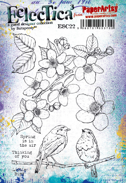
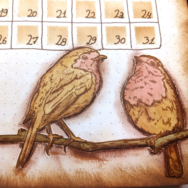
ESC22 links back to ESC19, they both have robins and flowers that I’ve drawn from pictures I took. The story behind these is that I love robins, so I wanted to create a stamp set with a robin on it. The idea came to me when I was pregnant. Few days after having the idea a robin posed for me and I had the chance to photograph it from the window at my living room. He changed to different places I could see from the window, I felt he was posing for me. I loved that moment so much that I decided to capture it in ESC19. And for ESC22, the story is a continuation. While we were in the first lockdown I was taking care of Matt and in the mornings while he was having his first nap, I would go to the back garden and observe the nature around me and photograph it with my camera. It was a peaceful moment, a me-time and it probably was the closest to a meditative state for me, so refreshing and energising.
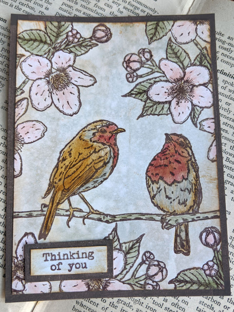
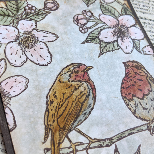
When I created ESC22, I had a handful of bird species to choose from in my camera, but the robin again was the perfect model, they pose so well! So he made it again. I decided to put two together as a symbol of love and friendship, because this year with the pandemic, I’ve missed the contact with people, and I thought about those that live alone and how maybe a sympathy card with these little birds and a simple “thinking of you” could cheer them up (picture below). This and the ESC23 stamp came as well with a feeling of Hope and happiness and looking forward for the pandemic to end. They may be a premature celebration but we can just hope for the best.
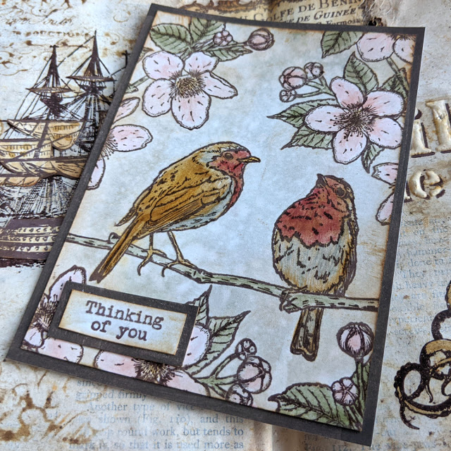
On a practical side now, these birds can be stamped together, or you could stamp them individually on tags. They can even kiss, because the branch can bend enough for the beaks to touch (this was a happy accident, I must admit), so they could also be used for Valentines or for weddings, etc. The flowers come from pictures I took from my walks and I thought these look very springy and since I love to colour and fussy cut flowers and leaves for my projects, these are perfect for working in journals and creating your own bouquets.
Thank You Birds

Whenever I get new stamps there is always a technique type card or tag I thrive to try with them, which is so simple yet so striking: stamp and smudge with oxide inks and bump effect with ink and grunge paste. I have many videos with this technique (and more they’ll keep on coming, because I just love it!) so my first sample with this stamp set was using those 2 techniques.

The shadow and bump effect is great. I love it!
Thinking of you
And after that sample, I made the one I showed you before, with the birds. In that one I just did some water colouring with infusions and some painting with glaze mixed with infusions.
The birds turned out a bit too dark for my taste, but I don’t mind it, because they pop up much more.
Eclectica³ Scrapcosy 23 (ESC23)

As with the previous stamp set, ESC23 came out as my attempt to bring happiness, excitement and hope. I love butterflies and I love to fussy cut them, give them a 3D effect with foam while attaching them to my projects. Same for the flowers, I love to create my own bouquets once I have a bunch cut. So all these are great for that purpose. I used the same font as in previous releases for the phrases and sentiments, and although I used a smaller font size, you could still combine my previous stamp quotes with these new ones to create new sentences. Or just combine the ones in this set to get new ones (FEELING the magic of LOVE, or the magic of LAUGH for example)
I started designing this stamp set around the time the positive results of the COVID vaccines were announced, so I was finally seeing the light at the end of a loooong tunnel, I could feel butterflies in my belly (hence the sentiment) thinking I may be able to hug my family in spring or summer, after a year away from them. I had to include the word HOPE, and I decided to add few more positive words, which all were dancing in my mind at the time.
So that was my positivism being transmitted in a stamp set and the coordinating stencil you’ll see below.
Red Butterfly

This first sample was made using the same technique as before: Distress oxide inks (aged mahogany in this case) for stamping and smudging, then the grunge paste for the shadow.

I love all the detail you get using oxides, even if you smudge them, and then how a few drops of water add a very characteristic effect.

Look at that shadow!
New Stencils
PaperArtsy Stencil (PS221)
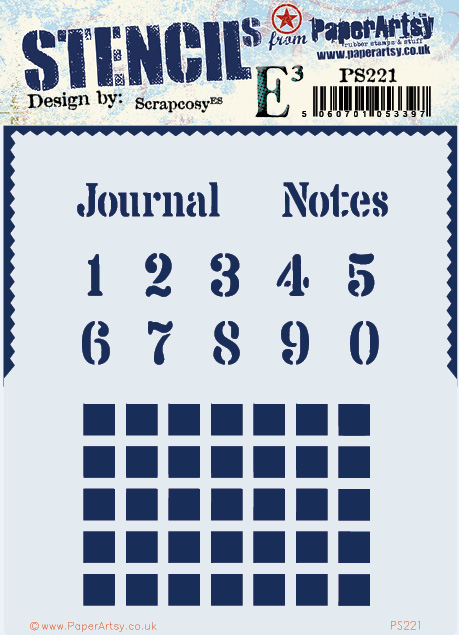
This is a very functional (but very useful) stencil. I made it to 100% match ESC21 set, so you could stencil the numbers and quotes to fit in the empty labels, squares to fit standard bullet journal sizes (dots are 0.5cm away) so you can create calendars. However you can use this stencil for other things.
I happened to see that lots of people (including me) were using my “Journal” word from the phrase “Tea Journal” on my old stencil PS107, so I decided it was time to give that word its proper space.
While creating my journals I always want a section in my weekly spread for Notes, so I added that word as well.
Both words could be used (with or without the rectangular label in ESC21) as a title for a journal, a notebook, a junk journal, or any other pile of pages grouped together where you plan to Journal or take notes. I thought it would be really helpful to have both.
Regarding the edge, it can be used to frame (with paint or with grunge paste) your cards or parts of your pieces.
And although the original purpose of the squares is to create your DIY calendar in your bullet journal as you will see in my project sample, you can also use it as a background and you can overlay it (repeated while shifting it) to create different layers of depth as my first sample will show.
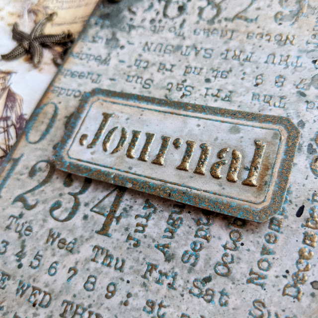
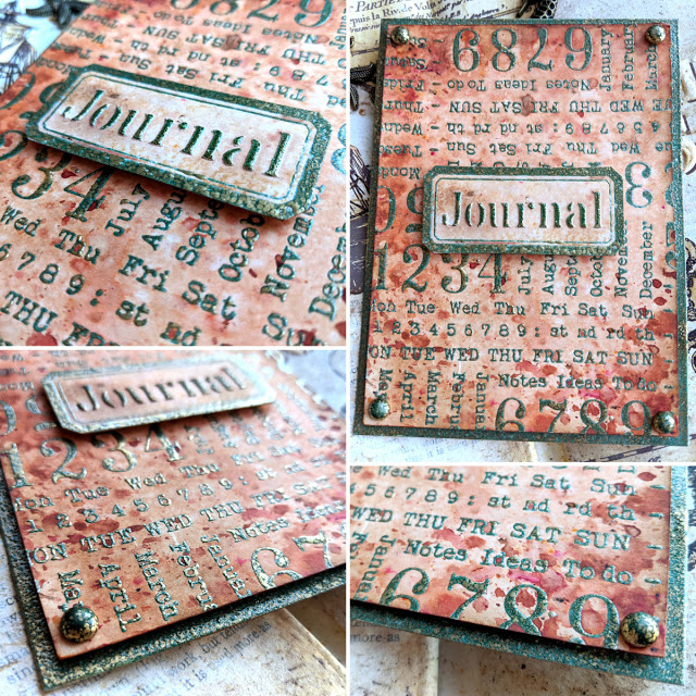
Journal tag

Here I’ve used the stencil in some of the ways I mentioned above (I completed my sample with ESC21, with the great background stamp)
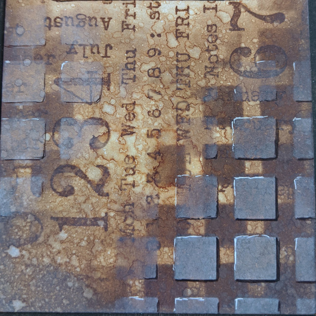
I love how the combination of dark squares in the back and shifted light squares in the front adds so much depth. I added some volume on the light squares with black pen, to add a shadow, and white gel pen, to add some highlights.

Since I applied some ink on top of the sentiment and you can see a glimpse of white of the grunge paste under the letters, when combining that with the the shadow (shifted Journal sentiment) it seems the letters are floating! I love the effect when you look at it this close!
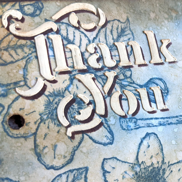
PaperArtsy Stencil 222 (PS222)
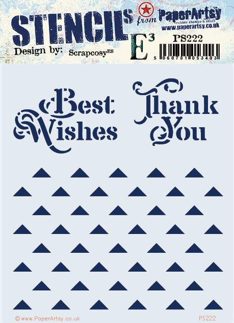
This stencil could match any stamp set, to be honest. I wanted to finally have the words “Thank You”. How could I don’t have that sentiment in any of my previous releases, I wondered? So it was time to bring it out! And I decided to pair it with a “Best wishes”, which could be used in different occasions, not only on Christmas. And about the triangles, you’ll think, bah, too basic. Well, wait to see how versatile these are, they are not JUST triangles, these can be stars, mountains and even Christmas Trees! And of course… triangles…
The cardboard accordion

I wanted to show you how versatile the stencil was when it comes to creating backgrounds, so I decided to create an accordion and display each background on each page. This is just the front cover, which I made out of cardboard, some paints and a little touch of my WOW embossing powder Egyptian Turquoise. I put “thank you” in the cover with grunge paste, because why not 🙂 A button and a thin twine acts as a closure mechanism.

The back is very similar, pretty plain, but anyway, it is the back. Let’s see the inside which is the interesting part!
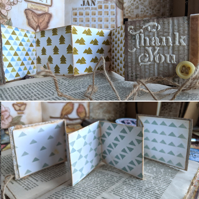
When you open it, you get this accordion, which has 2 sides and it has space for me to show you 10 possibilities on how to use this stencil (but there are more, I’m missing some and I’m sure you can even come up with more!).
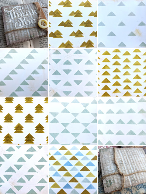
This is a summary of what you can get, but I’ll show you more details on how to make each design.

No secrets here, this is just ink through the stencil as it is. It will be the base for all the rest of the patterns. So on the other samples I’ll just let you know how I did the second part.
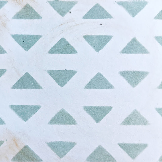
For this one you just need to turn your stencil upside down (triangles pointing down) and match the triangles so you get this pattern.
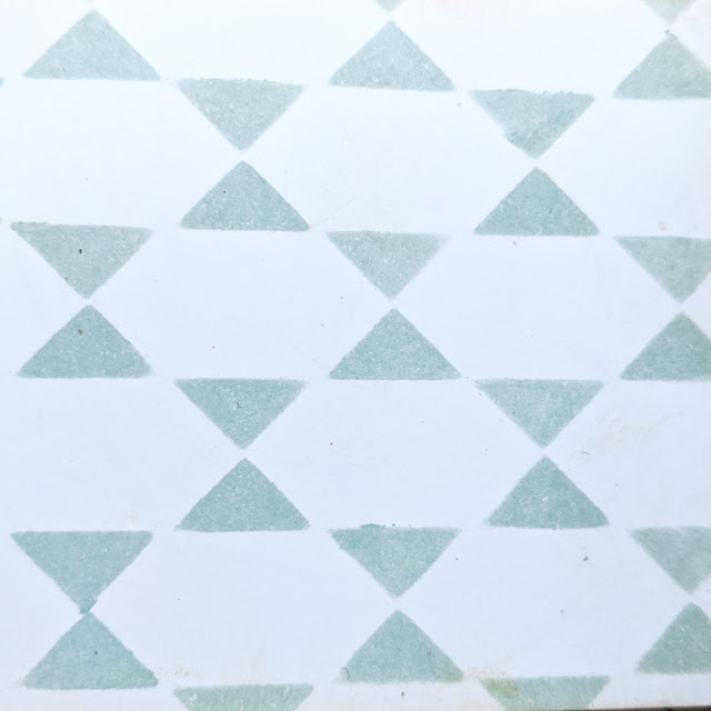
As above, put the second time the stencil upside down and try to make the triangles to touch in the pointy sides so you get a star.

As above, turn it upside down and this time try aligning them so they form a diagonal of triangles. Don’t make my mistake and wipe off the excess of ink from the back of the stencil. I didn’t do it and you see what you get after creating 4 patterns… Then I learned the lesson and cleaned it up in between samples 🙂

For this one you just shift the stencil to the right and up, so you get the diagonals on that direction.

For this one, just shift the stencil straight up (or down) so one of the triangles match the gap between the ones it has right under. It’s very simple and you just need to play with the stencil

For this one I used 4 colours of inks and I basically moved the stencil in 4 positions, clockwise: first the light blue (which is specked egg distress oxide), then move the stencil up and left and add the dark blue (faded jeans distress oxide), then move it up and right to add a dark green (forest moss distress oxide) and finally move it down right and add the light green (peeled paint distress oxide)
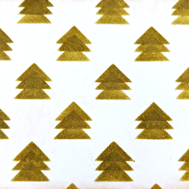
This one was such a great revelation, you just shift the stencil up twice after the first application and there you go, a bunch of Christmas trees! Looooving this pattern! You could take your time and decorate each tree or add some snow on the tips. That would be a very nice touch I think 🙂

And this one was also such a nice discovery, creating mountains (or pyramids…) and you can play around with how you distribute them. Here I added 3, but you could just leave 2 or you could create a group of 4 or 5 and even connect them if you dare! And being mountains, a touch of snow would also be interesting.

Finally, this one is just a matter of repeating the pattern 3 times while shifting up straight the stencil a little bit at a time.
PaperArtsy Stencil 223 (PS223)
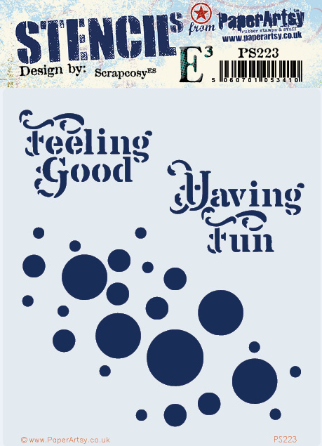
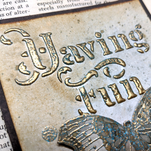
When I created this stencil I was in my positive mood and it was just after bringing the butterflies on ESC23 to life, so I was looking for butterfly quotes when I remembered the song Feeling Good by Nina Simone and it got stuck in my mind (…butterflies having fun, you know what I mean…), so that’s why I included Feeling Good and Having Fun. They are really powerful quotes as I found out later (you’ll see what I mean…). I decided to add a playful circle pattern that can be used to cover a bigger area or it can be turned and repositioned and some circles will overlap nicely. You can combine 2 different colours of paint or ink (or mediums) when you use this pattern in this “twice and turned” way.
Having Fun: A powerful and magic quote
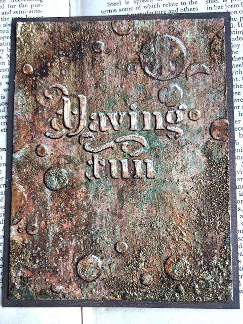
Feeling good is a powerful quote, if you create something with it and keep on reading the quote while you finish your art piece, I believe it can really make you start feeling better than when you started. And so is “Having fun”. While doing this card I was tempted to bin it between 3 and 20 times (or more…). It got saved from the trash by its quote and by Seth Apter’s influence. This sample has soooo many layers that I can’t explain how it was put together. I have a video that I’ll share in due curse, once I have it edited and all, but I can tell you that what started as a nice and fresh background using the new minty fresco colours by PaperArtsy coming out this month, combined with some coral and pink tones, after an extra layer, and an extra layer, and one more layer,… it started to look awful (for SEVERAL layers in a row). But then the quote came to rescue and I thought: You’re just having fun. I doesn’t matter what you end up with. If you don’t like it at the very end, you bin it. End of. Let it be a hot mess for a while and see what happens. Then on the eleventh time or so that I considered sending it to the bin, Seth came to my mind to rescue this card, his words reminded me “you’re always one layer away from magic” (and from crap… all were currently crappy layers… but never mind I gave it a go). So I decided to carry on, add more layers, have fun and let Inspiration find its way to me (Inspiration probably needed a map and a compass at this point to find me… my Gosh, what a hot mess I had in front of me…)
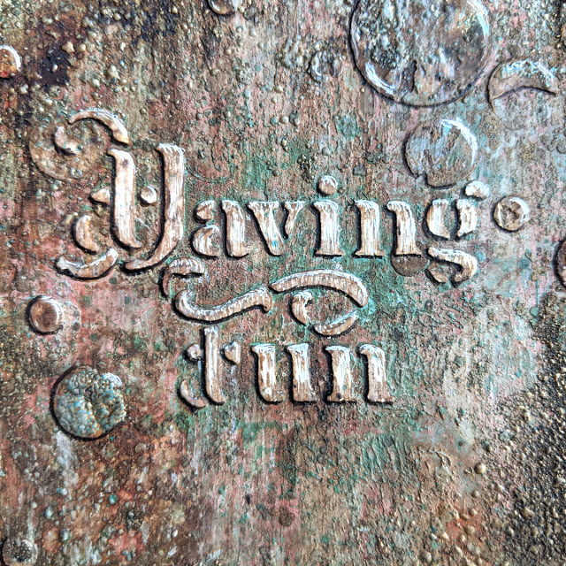
After what could probably be 20 or 25 layers and with the background not looking that bad, I stopped and started thinking on what was the problem and I decided to fix it! The quote was not standing out! So I decided to bring it up by scratching the grunge paste with a needle-like tool and retrieve the white, and adding some shadows and some light with both a black pen and a white pen. And oh my gosh, that really made it! magic was starting to happen!

And I decided to carry on with that technique (which to be honest, was also Seth’s inspiration coming to rescue) and apply that on the bubbles around, to make them pop to.

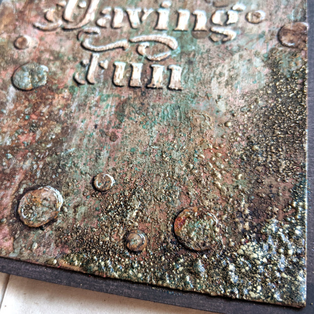
And I decided that after so many layers, why not, I could always add some gold, so I went to my WOW embossing powders and put them here and there (Seth if you’re reading this, you were really helpful and a source of inspiration, I hope I’ve made you proud…) and FINALLY (a grunge) magic happened! And I slept happy that night with a smile on my face 🙂
Butterfly Having Fun
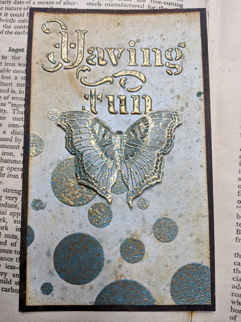
This other sample was made with Egyptian Turquoise WOW embossing powder combined with Infusions Sleight blue.
I love how the sentiment pops up. And it won’t be the last time to use this Grunge paste + embossing powder technique. I love it, it’s like double-embossing!
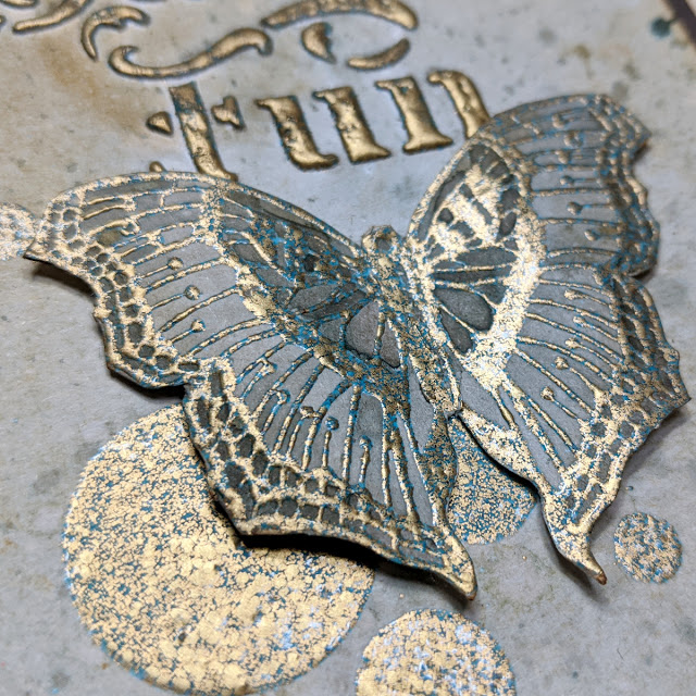
The butterfly stands out with the 3D foam adhesive on the back. I really like to add volume to my projects and bend and curve the paper.
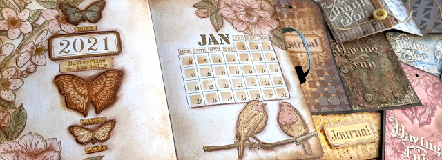
Project: Bullet Journal – January 2021
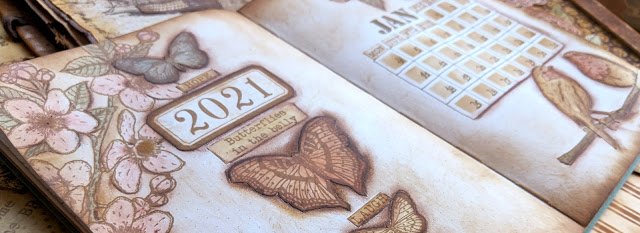
And finally, I’m so thrilled to share this project with you! In this first picture you can see how all stamps can be mixed and matched together.

There seems to be a lot of depth, but that’s me using a brown stabilo all pencil to create the shadows to make each image pop, everything is super flat, no real volume at the touch (the journal needs to close if you want to carry it with you until end of year!)

The way I like to work with stamps and the bullet journal is to create my own stickers using an A4 label paper (which is removable), stamping with waterproof ink (Archival ink vintage photo) and colouring with a mix of satin glaze and infusions.
Then I cut and I age edges with Distress Vintage photo (Oxide version gives me a lighter touch than the dye one).

You can see the before and after. It may not be very obvious in the picture but it really makes a difference in real life!

I combine my DIY stickers with actual stamped and coloured images on the page. I stamp on the journal what I’m sure will be there (flowers on the corners, in this case) and I use the stickers and play with them until I find the composition I like (butterflies, labels and words).
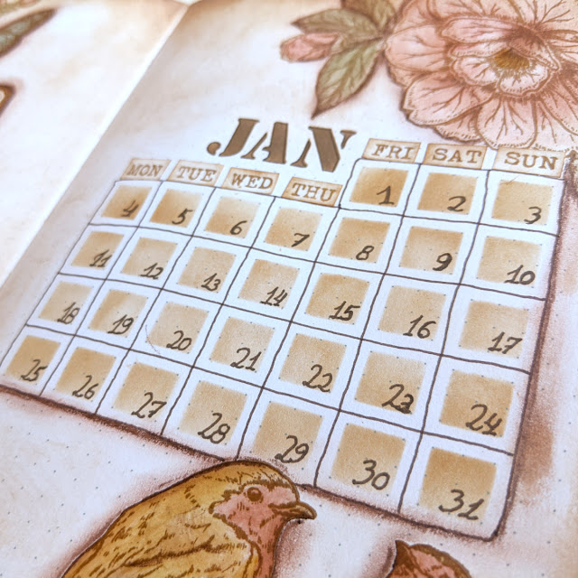
As you can see, the PS221 stencil matches 100% the grid and I was able to create very easily with ink a squared area in the shape of the month of January 2021. I sticked the days of the week on top of the squares and I used my old PS071 stencil to add JAN.
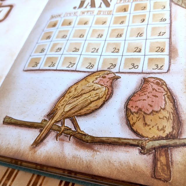
I love how the birds stand out as well, I stamped these and the branch and I sticked them like that. The shadow really makes them pop.
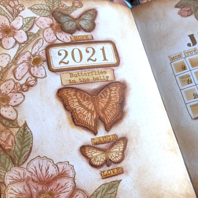
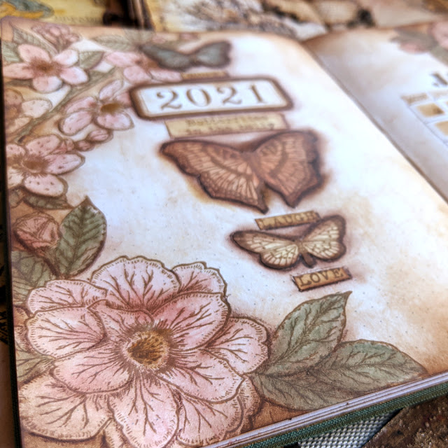
And I can’t stop looking at those 3 butterflies. I’m in love with this arrangement!
Now sharing with you few pictures of the rest of the weekly spreads for the month of January and further down below, there is a video in case you want to see how all came up together.

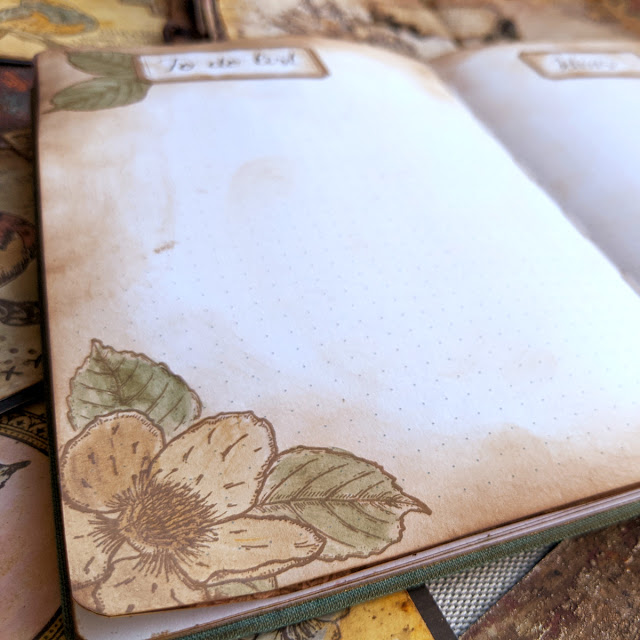
I like to add a fist couple of pages for all the month where I can start typing pending things to do and ideas that may come up, for new designs, videos, classes, projects.
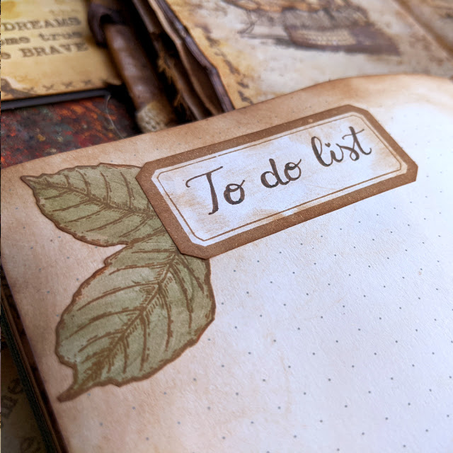
You don’t need to decorate a lot, I love how simple but cute the title is.
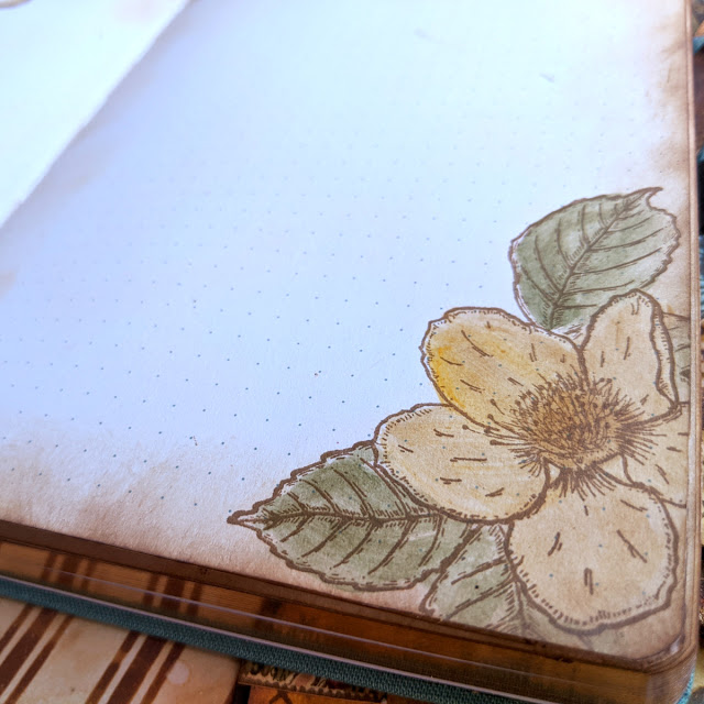
And in this case for the corner I stamped directly on the paper (masking the flower) instead of using stickers.
Same here

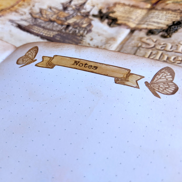
For this first week I decided to put the seven days on the left and leave a big page for Notes
The butterflies are the little butterfly from ESC23 which I’ve cut one wing so it seems it’s flying towards right or towards left and then I can play with symmetry for the title.

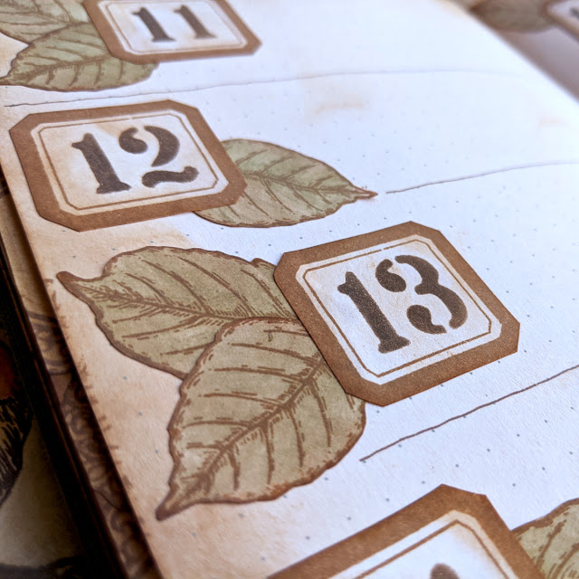
I looove the stacked medallion in different sizes. These and the numbers are from ESC21, and the numbers are the big background stamp cut in pieces, so I can use these separately.

And because I love these so much, here is even a closer look 🙂

This is week 2, and it matches the style of the “To do list” initial pair of pages. I liked that one so much that I wanted to use the same approach for a weekly spread

I couldn’t pick just one picture, so… I share with you 3 of them!
Love it! And in this case the numbers are stencilled (using PS221)
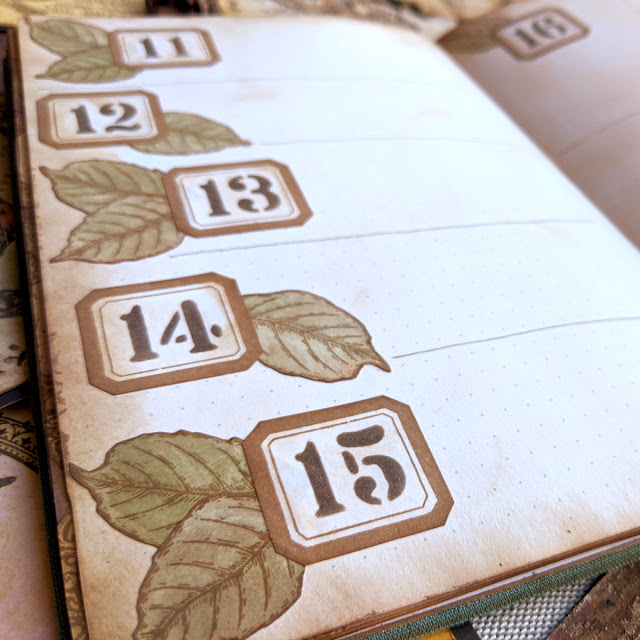
I may repeat this in autumn and just change the colour of the leaves to browns and oranges and yellows…

I stencilled also the “Notes” word from PS221 using the label in ESC21, and as you can see it fits perfectly. I’ve wanted to create a label like that for so long! Finally it’s mine! Muahahahaha! Maybe I’m a bit obsessed? LOL

Third week, not my favourite, but still pretty. I recently changed the oval labels so the days of the week meet the middle of the oval, I’ll show you in the Facebook live. That’s the good side of using removable sticker paper, that you can even change it after you’ve started using the planner.

These are also stickers and I love how light you can go with infusions if you like. It’s like a pastel look. Very spring time like, right?

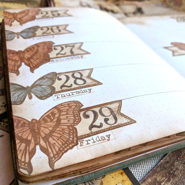
And finally, welcome to my favourite week! I love this arrangement! I may not have a bunch of space in my week, but I can write small just to have those glorious butterflies combined with the banners and the week days.

So satisfied with this spread… I love when I open my planner by mistake on this week (maybe because it’s the last one I worked on and it may be a bit easier to open there) and I just realised that is my release week!! I’m double happy now 🙂
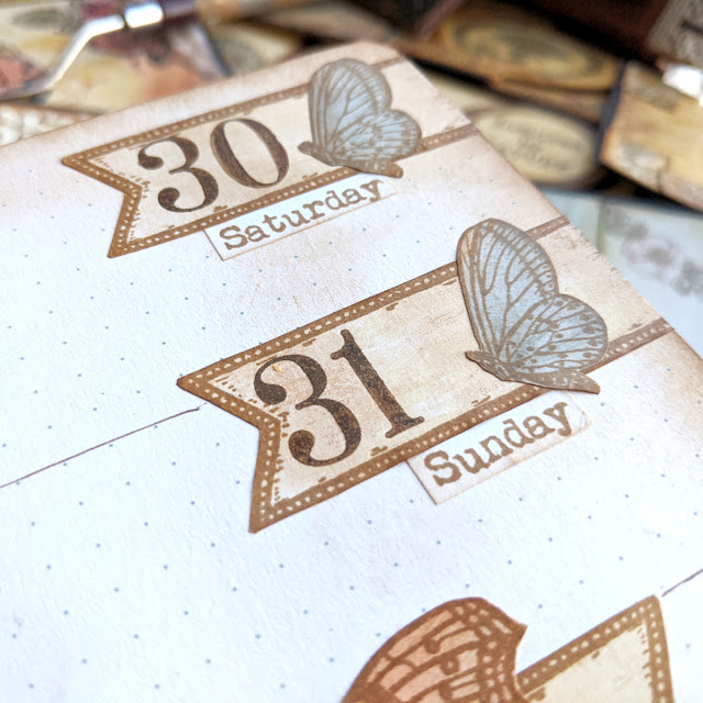
For Saturday and Sunday I decided to bring the fourth butterfly which I’ve been ignoring in the previous samples, poor thing. It’s so cute! I made it look to the left because I have another butterfly on ESC17 that looks to the right, so then I can choose one or another depending on the project I’m working on (lesson learned after working with ESC17 and being forced to place the butterfly always on the same side of the flowers…)

And of course, you don’t need to commit to use the butterfly always as it is. Open up your imagination and create new collages with what you have. Again, the fact of using with a fussy cut image is that you can cut it even further and play around with the items until your collage looks great to you, easier than masking. I love this title for the notes. What do you think? 🙂

Final pictures of the spread. Again I couldn’t choose, so here you have 2.
That was all! No more pictures! But if you want to carry on or just to see how this January came up, you can watch the video. Enjoy!
Remember I’ll be live in some minutes (8pm UK time) in Facebook (PaperArtsy group) to show you these samples and to talk a bit more about the release. I’ll be thrilled to see you later!
You can also find me here:
Website: https://scrapcosy.com/
YouTube: https://www.youtube.com/c/scrapcosy
Instagram: https://instagram.com/scrapcosy/
Facebook:
- This is my profile: https://www.facebook.com/raquel.burilloperez
- And this is my newly created FB group for everything scrapcosy (I’ve called it Scrapcosy’s crafty party). Come and join me! Share all your creations with everyone in the group! https://www.facebook.com/groups/scrapcosy/
Teaching Schedule:27/02, Stampers Grove – online class through a Private Facebook group, inscriptions will open on 06/02 if all goes well! Make a note in your diary!
