
Hi everyone! Today I’m bringing you a project made for the current PaperArtsy fortnight challenge. This one is called aqua, for the aquamarine colour. The challenge is to use just this colour to create a project. In my case I’ll create a card using my previous released stamps ESC03 and stencil PS051 and you’ll be able to see all the steps in the video I created.
Hola a todos! El proyecto de hoy es para participar en el reto de PaperArtsy que sucede cada dos semanas. Esta vez va del color “aqua” que para nosotros es el turquesa (o eso espero, porque sino la he liado parda…). El reto consiste en usar solo esa gamma de colores para crear un proyecto. En mi caso he optado por hacer una tarjeta en la que he usado unos de los sellos que saque en Febrero, el ESC03 y el estencil a juego PS015. Todos los pasos están en el vídeo a continuación.

En castellano por aquí / Spanish here
I normally don’t use blue colour in my projects, if you follow me you’ll know I’m more of browns. And specially I wouldn’t go for aqua, which is such a vibrant colour, no vintage at all, so it really was a challenge for me to play with it and I must admit that I really enjoyed it.
The main colours I used for my aqua palette were: A Bit Jaded Infusions and Bora Bora Fresco Paint. I found these combine very well together. I just used Bora Bora to tint my grunge paste and to paint an embellishment lines that divide the 3 sections of the card. And I used A Bit Jaded Infusions everywhere else.

A Bit Jaded Infusions is such a beautiful colour! Specially when you use my technique of applying water and then alcohol. It creates puddles of the different colours that are in the bottle and once dry, they give a feeling of a mosaic to me. Depending on the amount of infusions the result changes a lot, just compare the top and the bottom:

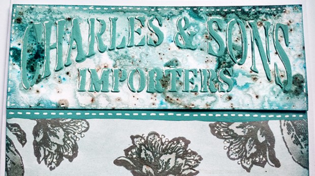
For the centre piece I additionally I added some Black Knight Infusions and water in my craft sheet and with a brush I coloured the flowers in light grey tone and I gave a wash with A Bit Jaded, so I would get a watercolour effect

And the final incorporation to the palette of blues is some Broken China distress ink to add accent to my borders. Finally I added some highlights I using a white gel pen for the letters and borders.

But better that you see all the process yourself in a video than reading a 10,000 words:
I really had fun participating in this challenge. It really got me out of my comfort zone and I enjoyed it a lot: I’ve never played with just one colour and even less if it’s such a vibrant tone, no vintage browns just blues, I decided to not add real embellishments, just paper and colour and it was the perfect excuse to finally use my A Bit Jaded Infusions, which by the way is BEAUTIFUL. Am I going to the dark side? Or should I say, the vibrant side?
I hope you liked it! Thanks for reading! And see you in the next one! 🙂 If you want to send any comments or subscribe, go to the end of the post below
AQUA – UN RETO DE PAPERARTSY – TOPIC #9
Normalmente yo a penas uso el color azul en mis proyectos. Si me sigues sabes que soy más de marrones. Y sobretodo no iría a por un turquesa sólo, que es tan llamativo, así que esto definitivamente ha sido un reto para mí y tengo que admitir que me ha encantado jugar con este color y he disfrutado mucho.
Para crear mi paleta de colores turquesa he elegido dos productos: el color de Infusions A Bit Jaded y Pintura acrílica (Fresco Paint) de PaperArtsy del color Bora Bora. Creo que ambos colores combinan muy bien. Utilicé el Bora Bora para tintar mi pasta de textura Grunge Paste (también de PaperArtsy) y para pintar unas líneas divisorias entre las piezas de la tarjeta a modo de decoración. Y para el resto utilicé A Bit Jaded:
El color A Bit Jaded de Infusions es tan bonito! Sobretodo me encanta cuando utilizo mi técnica de aplicar unas pulverizaciones primero de agua y luego de alcohol (sí, sí, alcohol de curar). Se crean charquitos de los distintos colores que forman el turquesa y una vez secos, parece un mosaico. Dependiendo de la cantidad de infusions, el resultado es muy diferente, sino comparad la parte de arriba (menos Infusions) con la de abajo (más Infusions):
Para la parte central de mi tarjeta decidí incorporar a la paleta un gris, así que elegí el Infusions Black Knight diluido en agua en mi craft sheet y con un pincel pinté las flores de gris. Luego con A Bit Jaded y un pincel más gordo pinté todo el fondo con cuatro pasadas rápidas y conseguí un efecto acuarela.
Para acabar con los azules, incorporé un poco de tinta distress Broken China en los bordes con una esponja para acentuarlos y con un puntafina de gel blanco apliqué detalles de falso cosido y acentué parte de las letras.
Pero más vale un vídeo que 1000 palabras, así podéis ver todo el proceso:
Realmente me lo pasé pipa participando en este reto. Me sacó del todo de mi zona de confort y aún así lo disfruté un montón: Nunca me había limitado a un color y aún menos a un color tan llamativo y alejado de mis marrones vintage, además decidí no incorporar adornos como lazos o puntillas sino que quise crearlos yo misma con papel y colores y este proyecto ha sido la excusa perfecta para estrenar mi Infusions A Bit Jaded, que por cierto es precioso! Me estaré pasando al lado oscuro? O más bien al lado claro?
