It’s Topflight Stamps 7th birthday and to celebrate, I’ve teamed up with some great designers to showcase celebratory projects using the unique products available at Topflight Stamps. Please hop along with us and see all the beautiful talent from this group of amazing designers! There is a master list of Hop stops on the Topflight Stamps blog! We are also Hopping on Instagram! You can start at the Topflight Stamps account @topflightstamps .
Did we mention there will be prizes?
GIVEAWAY DETAILS
Of course, it wouldn’t be a birthday celebration without prizes! Topflight Stamps is giving four lucky winners $50 Gift Certificates to the store. Two winners will be chosen from commenters on the blog hop and two will be chosen from commenters on the IG hop. For a chance to win, make sure to visit the stops on the hop and leave a comment by April 1st. Winners will be announced on the Topflight Stamps blog on Monday, April 3rd. U.S.A winners only due to shipping issues. Good Luck!
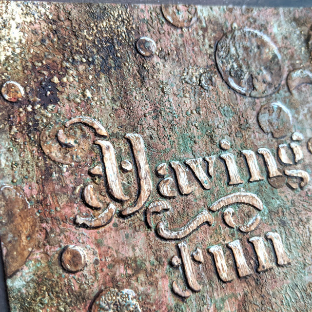
Here’s the project I made for the hop, an art journal page that celebrates the birthday of Topflight, 26/03. The butterflies represent the plane of their logo in spring season.
I used these 4 stamp sets that you can find at Topflight Stamps shop, which are some of my favourite. I’ve added their links below:
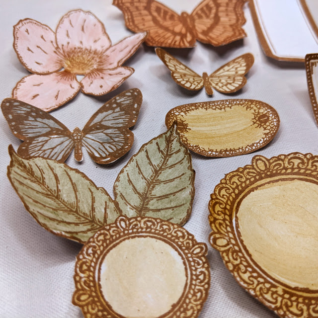
I used the butterfly and the flowers from ESC18. This stamp set is the one I enjoy the most using. The elements it has are so versatile and useful that I’m never tired of it.
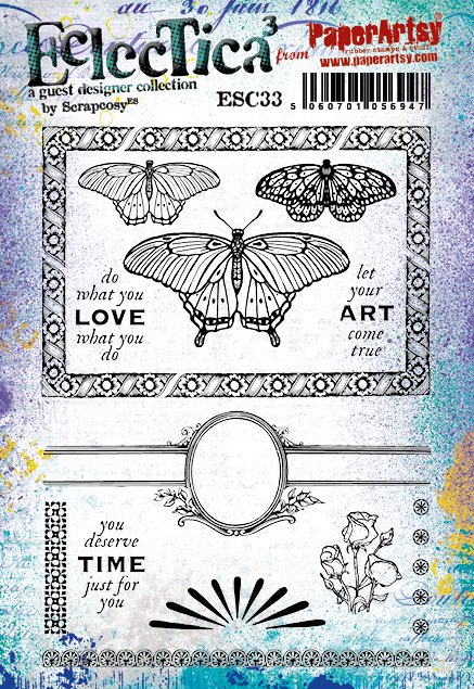
I used the word CELEBRATE and some labels from ESC34. I love this set, it’s perfect for masculine cards but also for scrapbooking and to create your own ephemera. I love the frame around the man and the labels, it’s cut in pieces so you can build the biggest frame or the smallest one in the shape you want by combining the different pieces (same as you would do with the frame on ESC33 above).
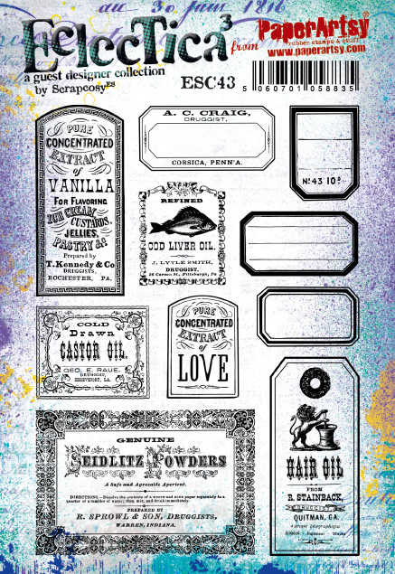
And from ESC43 I used some of the labels. This is again one of my favourite stamps. I love ephemera, so this one is just a never-ending supplier of vintage labels, both full and empty.
Once I stamped all the images with Nocturne Versafine Clair ink on top of smoothy cardstock by PaperArtsy, I painted them with the Mattint paints Shark, Fern and Glow, then I cut them and aged them with Distress Vintage Photo Ink.
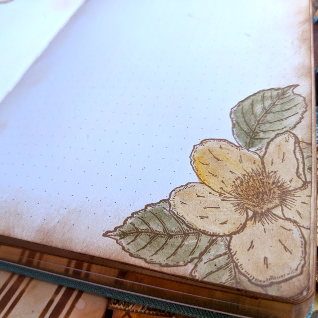
The papers in the back belong to my 2 books Art Journal Vol 2 and Vintage Covers Vol 2, which are meant to be cut and used as decorative papers in whichever form you like.
Here’s a short video on how I made the Art Journal page, I hope you like it
Don’t forget to comment along on this post and the rest of the blogs in the hop as well as on instagram. Thanks very much for your visit!
Hi everyone! I’m really thrilled to share this project with you today! I’ve created this for the current topic at PaperArtsy blog: Nature’s Treasure. Despite its small size it was a huge project, perhaps too ambitious, but the topic deserved it!
As you know (and as you may have seen from my latest release) I love nature, so this topic was the perfect opportunity to create something beautiful to use and display those many collected treasures that I’ve been finding and saving (or hoarding) in boxes for a long time. I love them! My precious… [she said with a Gollum voice… LOL].
I wanted to create something that could display some specimens as they are, because they are already beautiful and I just wanted to preserve them and admire them later. And at the same time I wanted to use some of those treasures as embellishments to enhance and add textures to my art pieces, so I came up with this idea: I would create some sort of cabinet (or mini jewellery box) with a pair of drawers that I could remove and I would store a mini art journal in the middle. My idea was to fill the art journal as well for today, but I had to limit myself to just one spread because I didn’t have more time, but I’ll share with you what ideas I have in mind for the rest of the journal pages.
I will be in PaperArtsy People at 7:30 pm (London Time) today to say Hi! and show you my newest stamps and samples, so if you have any questions do drop by or catch the replay!! If you want to buy these stamps, they are available EXCLUSIVELY from PaperArtsy approved stockists. Check out the list at the bottom of the PaperArtsy post!
Hi everyone! I’m so excited today! My next 3 stamps and 3 stencils with PaperArtsy are being released today! This time Autumn themed. Welcome to my forest, I hope you enjoy the walk. I hope you like it!
I just wanted to share with you the live online class that I’ll be teaching on Saturday 27th February, at Stampers Grove, 1pm UK time. This 3 hours live online class is open worldwide, it will be held at a private Facebook group and you can attend from the comfort of your home, you’ll be able to ask me questions while you craft along with me or just while you watch.
After the class, you’ll be able to watch it on replay at the private Facebook group for 6 months, so you’ll have all that time to watch and to create your project at your own pace. You can register at Stampers Grove site.
In the class I’ll teach you how to create this folder from scratch and we will create 4 (+ 2) technique tags using Infusions in many different ways along with my my new WOW embossing powders TRIO, Ancient Jewels, my newest butterfly stamp set ESC23, and the coordinating stencil PS223.
When you buy the class and the products from Stampers grove you can choose to get as well a mini kit that I’ve prepared for you which we’ve called “the butterfly kit”. It consists of a little manila envelope with a button, a tea dyed by me ribbon, a lace and a twine so you can get the very same look as I did.
Here are all the tags and more images of the folder:
The class costs less than a restaurant meal (£15) and all the information and supplies are at Stampers Grove site if you want to register. Feel free to write any questions you have in the comments below! And I hope to see you and talk to you live at the class!!
I will be in PaperArtsy People at 8:00 (London Time) today to say Hi! and show you my newest stamps and samples, so if you have any questions do drop by or catch the replay!! If you want to buy these stamps, they are available EXCLUSIVELY from our approved stockists. Check out the list at the bottom of the PaperArtsy post!
Hi everyone! I’m so excited today! It’s (double) release time after such a long pause of… one year! Scary! My next 3 stamps and 3 stencils with PaperArtsy being released today in addition to my very first 3 WOW embossing powders. You may have seen the powders and some of these sample already today in the telly, since my lovely Marion Emberson will have gone to Hochanda and presented these at some point today! It’s been a tough year for everyone, and in my case I’ve had many things to juggle: my baby Matt becoming a toddler, me and my partner working from home, nursery starting, therefore combining the home-working with babysitting for several weeks, across months (while Matt got used to the many regular nursery viruses…), changing home and on top of that, the pandemic making things even “easier” for everyone… A year with no contact with the rest of our families, our first Christmas in London, lots of Skype and WhatsApp calls to compensate the fact we are far away from each other. It was nice, but I’m hoping this is the last Christmas we spend in this way!
With such a different and so busy year, I didn’t have much time and energy to craft, but I din’t want to give it up completely, so after a long pause of not doing anything at all I found an easy and not very much time consuming activity which helped me starting again. It brought back my mojo and confidence and it still involved getting a bit messy. It was bullet journaling. So for few months I created monthly spreads in different themes (you may have seen them in my Instagram account or even in my scrapcosy Youtube channel). I adapted it my way, in my vintage style and using my beloved infusions, and I’ll show you how, in a video I’ve included today, where you’ll see how I created my January bullet journal setup with the just new released stamps. Since I loved that much creating my planners and spreads during 2020, I decided that I wanted to have one stamp set and the coordinating stencil just for that, to help me with the bullet journal. So those are ESC21 and PS221 (thanks to Mark to make the names of all products in the release to match! I’m sure it’s not a coincidence… It makes it much easier to remember) I’ll explain more details about these below. And since we’ve been through a tough year, I wanted to create also stamps that bring people smiles, happiness and, most of all, hope! So people can share and send their creations to friends and spread some well needed happiness. I’ve never chosen a word for the start of a year (I really couldn’t think you can commit to just one word) but this year is different, I can only have one word in my mind which is “Hope”, and while I write this, tears are coming to my eyes… I truly just hope this is over (or really close to an end) and we can all survive and meet again, in person, and hug each other. OK, enough crying! I’ll let 2021 unfold and hope for the best! Don’t give up and stay strong and safe!
And now, let’s see what I’ve designed for this release! I hope you like it! 🙂
New Stamps
Price: RRP €21.92 +VAT Size:5″ x 6″ (13 x16.5cm) All stamps are individually trimmed onto cling foam, presented in a clear hanging bag with a laminated storage/index sheet.
Eclectica³ Scrapcosy Set 21 (ESC21)
This first stamp set ESC21 is what I call “the Bullet Journal stamp set”. As I said before, my only crafting time this past year has been working on my bullet journal. This stamp set and the coordinated stencil are to be used for that purpose, however, you can always use it for other things as you’ll see below. The bottom composition has 3 main purposes: (1) you can use it as a background stamp as it is, (2) you can stamp and fussy cut the words so you can then stick them in your journal or (3) you can cut apart the actual rubber stamp, isolate the numbers or sections of the whole thing into smaller pieces of rubber stamps. This composition comes carefully pre-cut for you (thanks to Mark and Leandra for such an effort when creating the stamps) it hangs together, but if you want to cut it apart, you only need to finish the cutting they started for you. That pre-cutting really helps clumsy people like me, who rush to cut their stamps apart and may make some mistakes and cut more rubber than what was needed (ahem…).
The round, square and oval labels are empty so you can stamp the numbers from the background or you can stencil numbers from the coordinating stencil PS221 below. The rectangular labels were made so the quotes from the stencil PS221 fit but also to fit the months from my old stencil PS071 (numbers in PS071 are also on the same size as the ones in PS221, so you can select the font you like the best).
And in the space left in the small double V banner, you can add any of the words “notes”, “ideas”, “to do” available in the background stamp or any other word (days of the week or months). All fit in! I wasn’t sure if it would be a welcomed stamp set, because it is one of those that seems more useful than beautiful, so I was just hoping it would make it through production. I’m glad I dared to give my idea a go and I’m so happy with the feedback I’ve got so far! I normally don’t get any comments from anyone until release happens, but this time, a couple of the PaperArtsy bloggers (and friends) really sent me a good feedback on this one when I was not expecting it, and I’m so happy for that! Thanks from the heart, ladies!! 🙂 It will be a staple for me and I’m sure for many other people. I just design things that I like to use and I’m sure I’ll come to this one many, many times. I wasn’t sure if people would appreciate it, but I’m not unsure anymore, they’re gonna love it!
The WOW cards
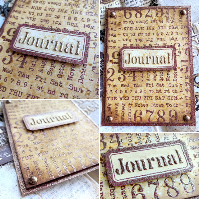
You’ll see more ways to use this stamp set in my main project below (Bullet Journal Spread for January) but as you can see, you don’t need to limit yourself to bullet journals with this one. The background stamp is gorgeous to use and you can create a card with the label in the middle and the sentiment of your choice. I just used the word Journal from the coordinating stencil, but it could be a happy birthday that you could handwrite and it would be a great masculine birthday card. I used my new WOW embossing powders as you may be able to tell. So I created these 3 cards to see how each powder performed in different ways and I combined them with 3 colours of infusions that I thought would look nice: golden sands for the red, rusty car for the green and a tone on tone, sleight blue with the blue powders.
My new WOW embossing powders trio collection is called “Ancient Jewels” and they look so yummy in the pot already. There is a green (Royal Emerald), a red (Decadent Ruby) and a blue (Egyptian Turquoise). I’ve used them with Grunge Paste, to decorate brads, to create a “single colour” card base and of course, I’ve stamped embossed them.
Here you can see the DIY brads and the single colour back card. The DIY metallic brads are very simple to make, paint them in white, add some wow embossing ink, dip into the powder and heat emboss. Make sure you use tweezers or you’ll burn your fingers! And the back card, you just swipe the embossing pad on the edges, apply powder and heat emboss.
Here is the sentiment, you apply grunge paste through the stencil, then the powders, then let it air-dry for 10 minutes or more and finally heat emboss it.
And just sharing 2 pictures of the other cards. The background was made using infusions after embossing the background stamp. The order is important, otherwise you’ll see your background altering the colour of the powders (they are a bit translucent).
Eclectica³ Scrapcosy 22 (ESC22)
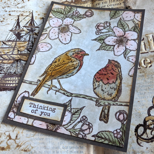
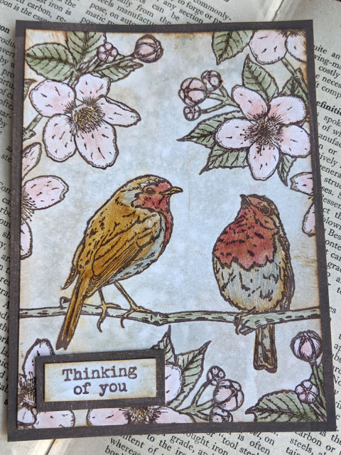
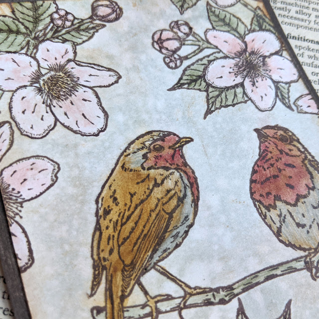
ESC22 links back to ESC19, they both have robins and flowers that I’ve drawn from pictures I took. The story behind these is that I love robins, so I wanted to create a stamp set with a robin on it. The idea came to me when I was pregnant. Few days after having the idea a robin posed for me and I had the chance to photograph it from the window at my living room. He changed to different places I could see from the window, I felt he was posing for me. I loved that moment so much that I decided to capture it in ESC19. And for ESC22, the story is a continuation. While we were in the first lockdown I was taking care of Matt and in the mornings while he was having his first nap, I would go to the back garden and observe the nature around me and photograph it with my camera. It was a peaceful moment, a me-time and it probably was the closest to a meditative state for me, so refreshing and energising. When I created ESC22, I had a handful of bird species to choose from in my camera, but the robin again was the perfect model, they pose so well! So he made it again. I decided to put two together as a symbol of love and friendship, because this year with the pandemic, I’ve missed the contact with people, and I thought about those that live alone and how maybe a sympathy card with these little birds and a simple “thinking of you” could cheer them up (picture below). This and the ESC23 stamp came as well with a feeling of Hope and happiness and looking forward for the pandemic to end. They may be a premature celebration but we can just hope for the best.
On a practical side now, these birds can be stamped together, or you could stamp them individually on tags. They can even kiss, because the branch can bend enough for the beaks to touch (this was a happy accident, I must admit), so they could also be used for Valentines or for weddings, etc. The flowers come from pictures I took from my walks and I thought these look very springy and since I love to colour and fussy cut flowers and leaves for my projects, these are perfect for working in journals and creating your own bouquets.
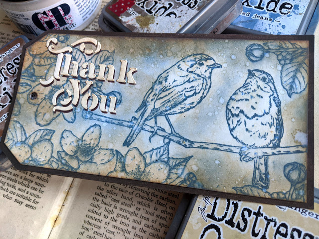
Thank You Birds
Whenever I get new stamps there is always a technique type card or tag I thrive to try with them, which is so simple yet so striking: stamp and smudge with oxide inks and bump effect with ink and grunge paste. I have many videos with this technique (and more they’ll keep on coming, because I just love it!) so my first sample with this stamp set was using those 2 techniques.
The shadow and bump effect is great. I love it! Thinking of you
And after that sample, I made the one I showed you before, with the birds. In that one I just did some water colouring with infusions and some painting with glaze mixed with infusions.
The birds turned out a bit too dark for my taste, but I don’t mind it, because they pop up much more.
Eclectica³ Scrapcosy 23 (ESC23)
As with the previous stamp set, ESC23 came out as my attempt to bring happiness, excitement and hope. I love butterflies and I love to fussy cut them, give them a 3D effect with foam while attaching them to my projects. Same for the flowers, I love to create my own bouquets once I have a bunch cut. So all these are great for that purpose. I used the same font as in previous releases for the phrases and sentiments, and although I used a smaller font size, you could still combine my previous stamp quotes with these new ones to create new sentences. Or just combine the ones in this set to get new ones (FEELING the magic of LOVE, or the magic of LAUGH for example) I started designing this stamp set around the time the positive results of the COVID vaccines were announced, so I was finally seeing the light at the end of a loooong tunnel, I could feel butterflies in my belly (hence the sentiment) thinking I may be able to hug my family in spring or summer, after a year away from them. I had to include the word HOPE, and I decided to add few more positive words, which all were dancing in my mind at the time. So that was my positivism being transmitted in a stamp set and the coordinating stencil you’ll see below.
Red Butterfly
This first sample was made using the same technique as before: Distress oxide inks (aged mahogany in this case) for stamping and smudging, then the grunge paste for the shadow.
I love all the detail you get using oxides, even if you smudge them, and then how a few drops of water add a very characteristic effect.
Look at that shadow!
New Stencils
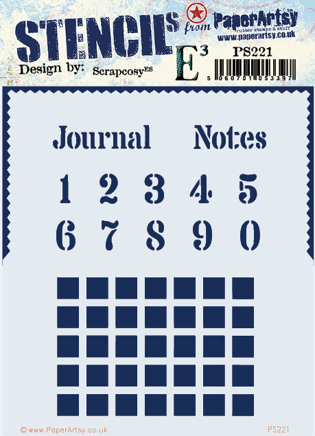
PaperArtsy Stencil (PS221)
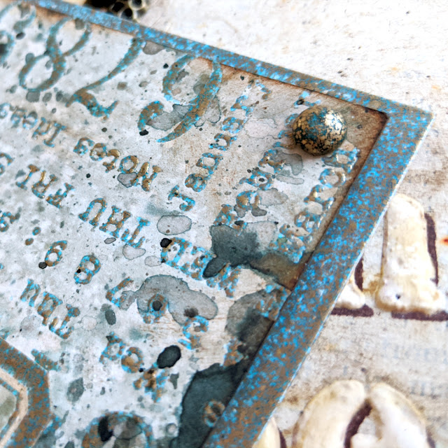
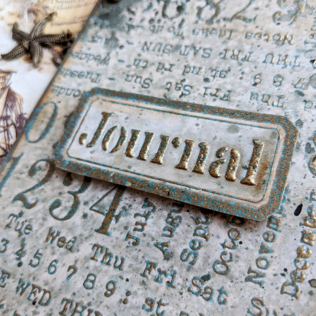
This is a very functional (but very useful) stencil. I made it to 100% match ESC21 set, so you could stencil the numbers and quotes to fit in the empty labels, squares to fit standard bullet journal sizes (dots are 0.5cm away) so you can create calendars. However you can use this stencil for other things. I happened to see that lots of people (including me) were using my “Journal” word from the phrase “Tea Journal” on my old stencil PS107, so I decided it was time to give that word its proper space. While creating my journals I always want a section in my weekly spread for Notes, so I added that word as well. Both words could be used (with or without the rectangular label in ESC21) as a title for a journal, a notebook, a junk journal, or any other pile of pages grouped together where you plan to Journal or take notes. I thought it would be really helpful to have both. Regarding the edge, it can be used to frame (with paint or with grunge paste) your cards or parts of your pieces. And although the original purpose of the squares is to create your DIY calendar in your bullet journal as you will see in my project sample, you can also use it as a background and you can overlay it (repeated while shifting it) to create different layers of depth as my first sample will show.
Journal tag
Here I’ve used the stencil in some of the ways I mentioned above (I completed my sample with ESC21, with the great background stamp)
I love how the combination of dark squares in the back and shifted light squares in the front adds so much depth. I added some volume on the light squares with black pen, to add a shadow, and white gel pen, to add some highlights.
Since I applied some ink on top of the sentiment and you can see a glimpse of white of the grunge paste under the letters, when combining that with the the shadow (shifted Journal sentiment) it seems the letters are floating! I love the effect when you look at it this close!
PaperArtsy Stencil 222 (PS222)
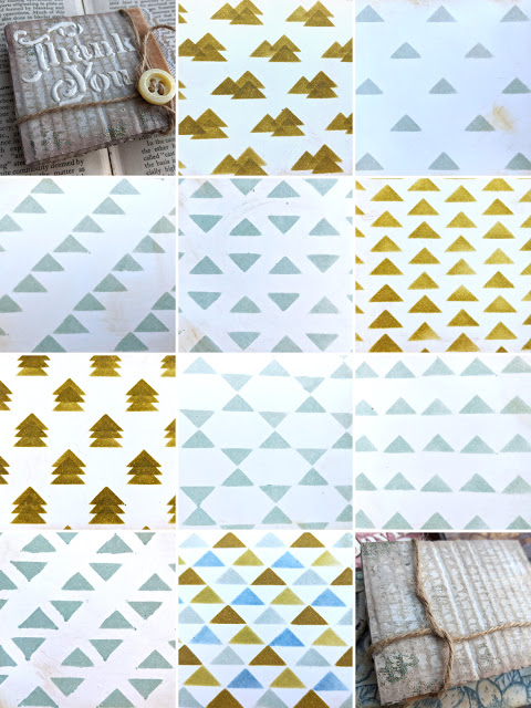
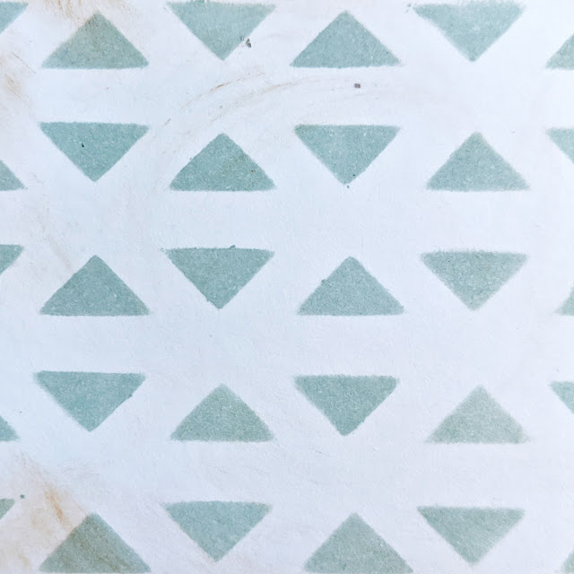
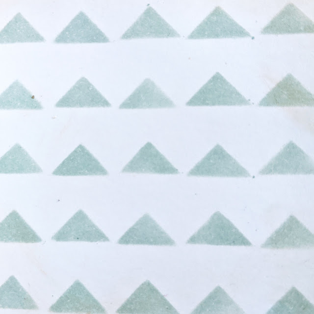
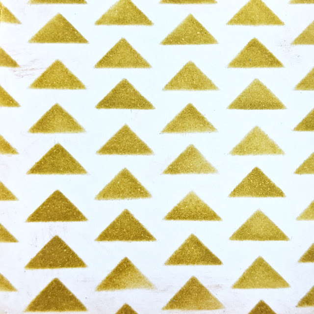
This stencil could match any stamp set, to be honest. I wanted to finally have the words “Thank You”. How could I don’t have that sentiment in any of my previous releases, I wondered? So it was time to bring it out! And I decided to pair it with a “Best wishes”, which could be used in different occasions, not only on Christmas. And about the triangles, you’ll think, bah, too basic. Well, wait to see how versatile these are, they are not JUST triangles, these can be stars, mountains and even Christmas Trees! And of course… triangles…
The cardboard accordion
I wanted to show you how versatile the stencil was when it comes to creating backgrounds, so I decided to create an accordion and display each background on each page. This is just the front cover, which I made out of cardboard, some paints and a little touch of my WOW embossing powder Egyptian Turquoise. I put “thank you” in the cover with grunge paste, because why not 🙂 A button and a thin twine acts as a closure mechanism.
The back is very similar, pretty plain, but anyway, it is the back. Let’s see the inside which is the interesting part!
When you open it, you get this accordion, which has 2 sides and it has space for me to show you 10 possibilities on how to use this stencil (but there are more, I’m missing some and I’m sure you can even come up with more!).
This is a summary of what you can get, but I’ll show you more details on how to make each design.
No secrets here, this is just ink through the stencil as it is. It will be the base for all the rest of the patterns. So on the other samples I’ll just let you know how I did the second part.
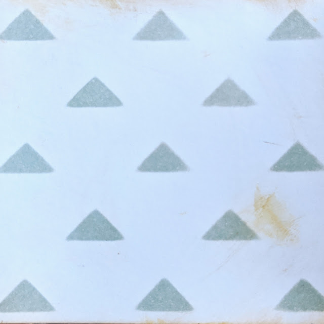
For this one you just need to turn your stencil upside down (triangles pointing down) and match the triangles so you get this pattern.
As above, put the second time the stencil upside down and try to make the triangles to touch in the pointy sides so you get a star.
As above, turn it upside down and this time try aligning them so they form a diagonal of triangles. Don’t make my mistake and wipe off the excess of ink from the back of the stencil. I didn’t do it and you see what you get after creating 4 patterns… Then I learned the lesson and cleaned it up in between samples 🙂
For this one you just shift the stencil to the right and up, so you get the diagonals on that direction.
For this one, just shift the stencil straight up (or down) so one of the triangles match the gap between the ones it has right under. It’s very simple and you just need to play with the stencil
For this one I used 4 colours of inks and I basically moved the stencil in 4 positions, clockwise: first the light blue (which is specked egg distress oxide), then move the stencil up and left and add the dark blue (faded jeans distress oxide), then move it up and right to add a dark green (forest moss distress oxide) and finally move it down right and add the light green (peeled paint distress oxide)
This one was such a great revelation, you just shift the stencil up twice after the first application and there you go, a bunch of Christmas trees! Looooving this pattern! You could take your time and decorate each tree or add some snow on the tips. That would be a very nice touch I think 🙂
And this one was also such a nice discovery, creating mountains (or pyramids…) and you can play around with how you distribute them. Here I added 3, but you could just leave 2 or you could create a group of 4 or 5 and even connect them if you dare! And being mountains, a touch of snow would also be interesting.
Finally, this one is just a matter of repeating the pattern 3 times while shifting up straight the stencil a little bit at a time.
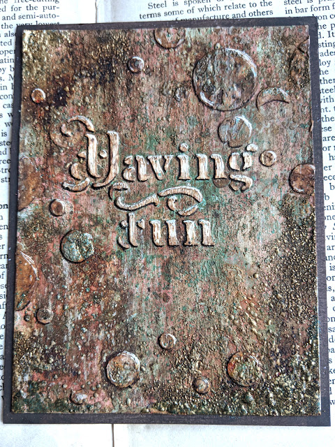
PaperArtsy Stencil 223 (PS223)
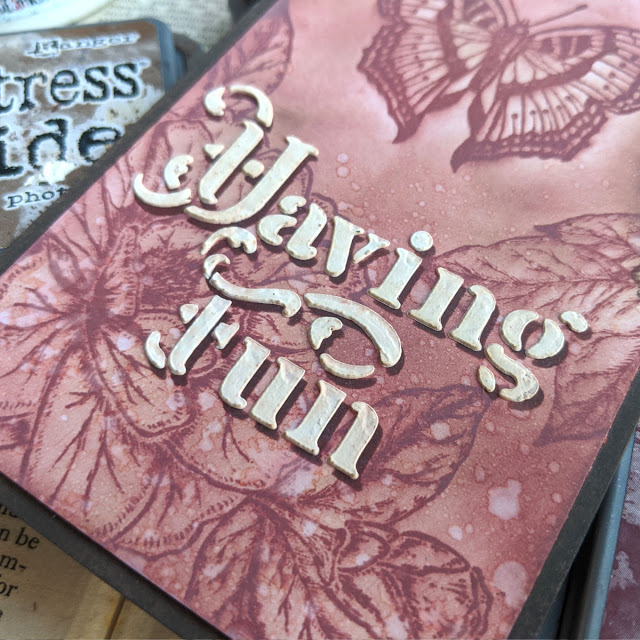
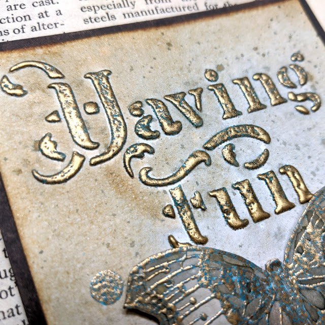
When I created this stencil I was in my positive mood and it was just after bringing the butterflies on ESC23 to life, so I was looking for butterfly quotes when I remembered the song Feeling Good by Nina Simone and it got stuck in my mind (…butterflies having fun, you know what I mean…), so that’s why I included Feeling Good and Having Fun. They are really powerful quotes as I found out later (you’ll see what I mean…). I decided to add a playful circle pattern that can be used to cover a bigger area or it can be turned and repositioned and some circles will overlap nicely. You can combine 2 different colours of paint or ink (or mediums) when you use this pattern in this “twice and turned” way. Having Fun: A powerful and magic quote
Feeling good is a powerful quote, if you create something with it and keep on reading the quote while you finish your art piece, I believe it can really make you start feeling better than when you started. And so is “Having fun”. While doing this card I was tempted to bin it between 3 and 20 times (or more…). It got saved from the trash by its quote and by Seth Apter’s influence. This sample has soooo many layers that I can’t explain how it was put together. I have a video that I’ll share in due curse, once I have it edited and all, but I can tell you that what started as a nice and fresh background using the new minty fresco colours by PaperArtsy coming out this month, combined with some coral and pink tones, after an extra layer, and an extra layer, and one more layer,… it started to look awful (for SEVERAL layers in a row). But then the quote came to rescue and I thought: You’re just having fun. I doesn’t matter what you end up with. If you don’t like it at the very end, you bin it. End of. Let it be a hot mess for a while and see what happens. Then on the eleventh time or so that I considered sending it to the bin, Seth came to my mind to rescue this card, his words reminded me “you’re always one layer away from magic” (and from crap… all were currently crappy layers… but never mind I gave it a go). So I decided to carry on, add more layers, have fun and let Inspiration find its way to me (Inspiration probably needed a map and a compass at this point to find me… my Gosh, what a hot mess I had in front of me…)
After what could probably be 20 or 25 layers and with the background not looking that bad, I stopped and started thinking on what was the problem and I decided to fix it! The quote was not standing out! So I decided to bring it up by scratching the grunge paste with a needle-like tool and retrieve the white, and adding some shadows and some light with both a black pen and a white pen. And oh my gosh, that really made it! magic was starting to happen!
And I decided to carry on with that technique (which to be honest, was also Seth’s inspiration coming to rescue) and apply that on the bubbles around, to make them pop to.
And I decided that after so many layers, why not, I could always add some gold, so I went to my WOW embossing powders and put them here and there (Seth if you’re reading this, you were really helpful and a source of inspiration, I hope I’ve made you proud…) and FINALLY (a grunge) magic happened! And I slept happy that night with a smile on my face 🙂 Butterfly Having Fun
This other sample was made with Egyptian Turquoise WOW embossing powder combined with Infusions Sleight blue.
I love how the sentiment pops up. And it won’t be the last time to use this Grunge paste + embossing powder technique. I love it, it’s like double-embossing!
The butterfly stands out with the 3D foam adhesive on the back. I really like to add volume to my projects and bend and curve the paper.
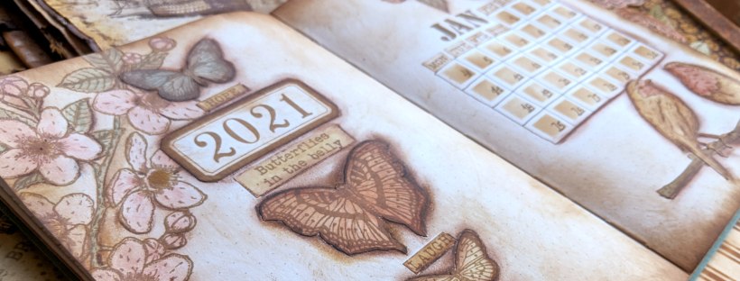
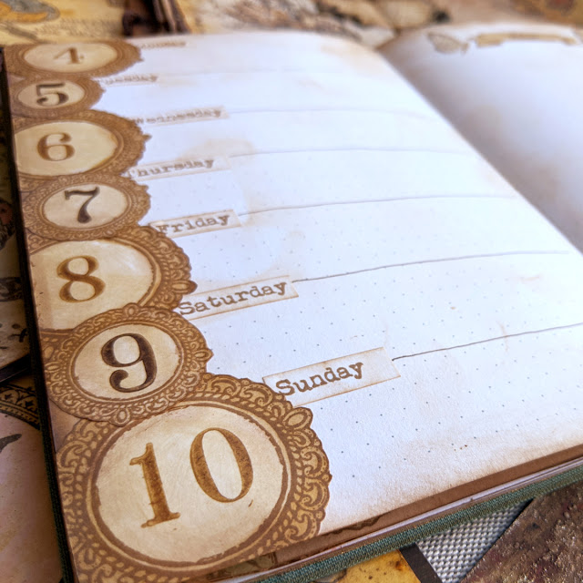
Project: Bullet Journal – January 2021
And finally, I’m so thrilled to share this project with you! In this first picture you can see how all stamps can be mixed and matched together.
There seems to be a lot of depth, but that’s me using a brown stabilo all pencil to create the shadows to make each image pop, everything is super flat, no real volume at the touch (the journal needs to close if you want to carry it with you until end of year!)
The way I like to work with stamps and the bullet journal is to create my own stickers using an A4 label paper (which is removable), stamping with waterproof ink (Archival ink vintage photo) and colouring with a mix of satin glaze and infusions.
Then I cut and I age edges with Distress Vintage photo (Oxide version gives me a lighter touch than the dye one).
You can see the before and after. It may not be very obvious in the picture but it really makes a difference in real life!
I combine my DIY stickers with actual stamped and coloured images on the page. I stamp on the journal what I’m sure will be there (flowers on the corners, in this case) and I use the stickers and play with them until I find the composition I like (butterflies, labels and words).
As you can see, the PS221 stencil matches 100% the grid and I was able to create very easily with ink a squared area in the shape of the month of January 2021. I sticked the days of the week on top of the squares and I used my old PS071 stencil to add JAN.
I love how the birds stand out as well, I stamped these and the branch and I sticked them like that. The shadow really makes them pop.
And I can’t stop looking at those 3 butterflies. I’m in love with this arrangement! Now sharing with you few pictures of the rest of the weekly spreads for the month of January and further down below, there is a video in case you want to see how all came up together.
I like to add a fist couple of pages for all the month where I can start typing pending things to do and ideas that may come up, for new designs, videos, classes, projects.
You don’t need to decorate a lot, I love how simple but cute the title is.
And in this case for the corner I stamped directly on the paper (masking the flower) instead of using stickers.
Same here
For this first week I decided to put the seven days on the left and leave a big page for Notes
The butterflies are the little butterfly from ESC23 which I’ve cut one wing so it seems it’s flying towards right or towards left and then I can play with symmetry for the title.
I looove the stacked medallion in different sizes. These and the numbers are from ESC21, and the numbers are the big background stamp cut in pieces, so I can use these separately.
And because I love these so much, here is even a closer look 🙂
This is week 2, and it matches the style of the “To do list” initial pair of pages. I liked that one so much that I wanted to use the same approach for a weekly spread
I couldn’t pick just one picture, so… I share with you 3 of them!
Love it! And in this case the numbers are stencilled (using PS221)
I may repeat this in autumn and just change the colour of the leaves to browns and oranges and yellows…
I stencilled also the “Notes” word from PS221 using the label in ESC21, and as you can see it fits perfectly. I’ve wanted to create a label like that for so long! Finally it’s mine! Muahahahaha! Maybe I’m a bit obsessed? LOL
Third week, not my favourite, but still pretty. I recently changed the oval labels so the days of the week meet the middle of the oval, I’ll show you in the Facebook live. That’s the good side of using removable sticker paper, that you can even change it after you’ve started using the planner.
These are also stickers and I love how light you can go with infusions if you like. It’s like a pastel look. Very spring time like, right?
And finally, welcome to my favourite week! I love this arrangement! I may not have a bunch of space in my week, but I can write small just to have those glorious butterflies combined with the banners and the week days.
So satisfied with this spread… I love when I open my planner by mistake on this week (maybe because it’s the last one I worked on and it may be a bit easier to open there) and I just realised that is my release week!! I’m double happy now 🙂
For Saturday and Sunday I decided to bring the fourth butterfly which I’ve been ignoring in the previous samples, poor thing. It’s so cute! I made it look to the left because I have another butterfly on ESC17 that looks to the right, so then I can choose one or another depending on the project I’m working on (lesson learned after working with ESC17 and being forced to place the butterfly always on the same side of the flowers…)
And of course, you don’t need to commit to use the butterfly always as it is. Open up your imagination and create new collages with what you have. Again, the fact of using with a fussy cut image is that you can cut it even further and play around with the items until your collage looks great to you, easier than masking. I love this title for the notes. What do you think? 🙂
Final pictures of the spread. Again I couldn’t choose, so here you have 2.
That was all! No more pictures! But if you want to carry on or just to see how this January came up, you can watch the video. Enjoy!
Remember I’ll be live in some minutes (8pm UK time) in Facebook (PaperArtsy group) to show you these samples and to talk a bit more about the release. I’ll be thrilled to see you later!
And this is my newly created FB group for everything scrapcosy (I’ve called it Scrapcosy’s crafty party). Come and join me! Share all your creations with everyone in the group! https://www.facebook.com/groups/scrapcosy/
Teaching Schedule:27/02, Stampers Grove – online class through a Private Facebook group, inscriptions will open on 06/02 if all goes well! Make a note in your diary!
Hi everyone! Now that Halloween is gone, let’s get some Christmas inspiration! Let me share with you the latest art journal spread I’ve created for the PaperArtsy fortnight Challenge: A Vintage Christmas. I really like creating Art Journals, but I always like to do something special about them. In the previous one I did a lot of fussy cutting and I played with colours that are out of my comfort zone. For this one the special thing is that it doesn’t have a fixed layout, you can change it a bit, it’s more playful! Some elements can be moved and changed around: a magnetic postcard and a double sided bookmark (gold/brown) which features a handmade crocheted chain. Of course, apart from those unusual elements, I used some of the usual suspects too… infusions and some of the new colours of PaperArtsy paints. Video coming too! I hope you like it! Enjoy!
Hola a todos! Ahora que Halloween ya ha pasado, vamos a por inspiración para Navidad! Aquí tenéis mi último Art Journal que he creado para el reto que nos propone PaperArtsy cada dos semanas, este se llama A Vintage Christmas. Me encanta crear Art Journals y siempre me gusta hacer algo especial en cada uno de ellos. En el anterior recorté una infinidad de imágenes y trabajé con una paleta de colores fuera de mi zona de confort y me encantó trabajar en él. Para este Art Journal de hoy, lo especial es que da mucho juego porque he creado elementos que no están fijos, se puede jugar con el diseño y cambiarlo de varias formas. Tiene una Postal magnetizada y una especie de punto de libro con elementos de dobles caras (doradas y marrones) que cuelga de una cadeneta de ganchillo que he hecho a mano. A parte de usar estos elementos, como no, usaré mis queridas Infusions y algunas pinturas nuevas de PaperArtsy. Y lo grabé todo en vídeo… 😉 Espero que os guste!
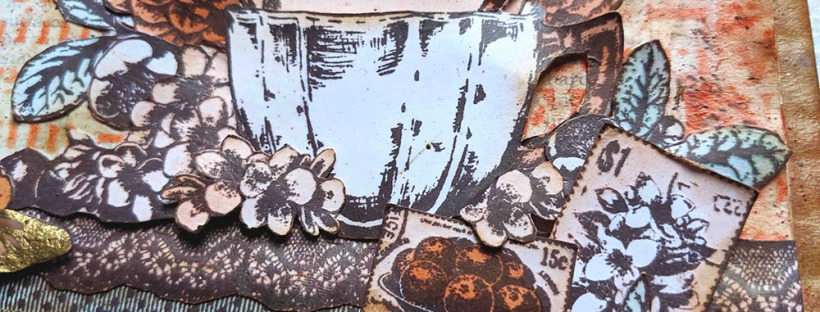
Hi everyone! Today I’m covering the current topic at PaperArtsy blog challenge which is Coral. I decided to create this art journal spread inspired by my tea set collection and the coral colour. I used very simple techniques, not many steps, but very time consuming… The result is a vintage tea garden full of details achieved with minimal art supplies (in terms of colour), but lots of stamps… I couldn’t help but use my entire tea stamp set collection! Get a cup of tea and enjoy the video, the images and all! I hope you like it!
Hola a todos! Hoy os traigo inspiración para reto que propone PaperArtsy esta quincena: Coral! He decido crear este Art Journal inspirado por mi colección de sellos de té y el color coral. He usado técnicas sencillas, no son muchos pasos, pero son muy laboriosos… El resultado es un Jardín de té vintage lleno de detalles realizado con muy pocos materiales (en cuanto a color) pero con muchos sellos… la colección entera! Preparaos una taza de té y a disfrutar del vídeo, las fotos y demás! Espero que os guste!
Hi everyone! Today’s post is not about the card, it’s about the video. This is a treat from my partner. He wanted to record me while creating this card in a different way than usual and he did a beautiful video editing with a lovely piece of music. I just added few pictures and some more music at the end but he really did the hard work. I’ve already watched it many times and I love it… 🙂 Now it’s your turn, enjoy it!
Hola a todos! El post de hoy no va sobre la tarjeta, sino sobre el vídeo de ésta. Es un regalo de mi pareja. Le apetecía filmarme mientras creaba la tarjeta de una forma distinta a la habitual y ha hecho un montaje precioso con una música muy bonita. Yo sólo he añadido unas fotos al final y algo más de música, pero él ha hecho lo más difícil. Yo ya lo he visto unas cuantas veces y me encanta… 🙂 Ahora es vuestro turno, disfrutadlo!
Hi everyone! I’m super excited to share with you my newest release for PaperArtsy: 2 stamps and coordinating stencils.
As you may know by now, I love vintage flowers and butterflies and other decorative vintage elements, so for this release I wanted to create 2 stamp sets with one big flower arrangement each, so we can simply stamp and colour and besides these, I wanted to add other surrounding elements that can help creating nice backgrounds and sentiments. Similarly, for the stencils, I went for my usual: patterns and sentiments. In this case just 2 patterns but lots of sentiments, since at the end of the day, I love stencilling these titles and use them as focal points in some of my creations.
Over the next few days, we will be sharing ideas with my newest products by myself and Jennie Atkinson, just go to PaperArtsy blog. You can also see ideas on Instagram, Facebook, Twitter, Pinterest that Leandra and I will share. So no matter what your preferred social media platform, we will be sharing with you!
Let’s start with some ideas with each of the new products.
Eclectica³ Scrapcosy Set 17 (ESC17)
I love these flowers. I have a confession, they are actually made up! I mixed my favourite blossoms and my favourite leaves to make this bouquet combination which by the way, it’s meant to fit size 8 tags (I love them as a substrate!). And I love the background herbs, I can’t wait to emboss them in gold!
I was going to just stamp and fussy cut the butterfly once, but I wanted to give it proper wings, so it’s done twice and glued in 3D (using foam and bending it) so that gives it a very airy finish.
The original sentiment (be CURIOUS and follow your TRUTH) has been altered and now it reads something different, so you can mix and match the words NATURAL INSTINCT as you want to create your own sentence (4 different combinations if you do your maths).
And I haven’t used the ribbons, but as you may have seen on the first sample that Leandra shared, that these are perfect to frame sentiments or whatever you want. I loved adding these when I did my previous release (tea related) and I wanted to add a couple more to complete the whole thing.
Eclectica³ Scrapcosy Set 18 (ESC18)
I love browsing old flowers catalogues from the past centuries and in one of them I found a letter from the company owner in a hand-written style font that I fell in love with, it’s perfect for backgrounds or even to stamp into Grunge Paste. And the round postage stamp mark had to be here. In my previous tea collection release I added postage stamps and now with this stamp, you can mark them and add an extra vintage mail related touch to your project. When I found these flowers I knew they were perfect to colour and fussy cutting, so it was no brainer, they had to be here as well (and again, perfect for a size 8 tag!). And the butterfly, well, I just love these creatures, so why not getting an even bigger version that before, so easy to cut and bend it to set it to fly!
PaperArtsy Stencil 133 (PS133)
Stencils are very versatile, and in this case for this sample I went for a flat finish, no volume, created with distress oxides. But you can use many other things with them: fresco paints, infusions and glaze, ink sponged through or just a spray. Or you can go for volume and apply Grunge Paste to create 3D sentiments. I decided to incorporate the same sentiment as one of the sets for this sample, but the stencil incorporates another sentiment (bloom like a rose) that would 100% match as well a previous stamp set of mine (ESC04). There are 2 patterns on this stencil and you could overlap them if you wished or you can just extend one of the patterns by repositioning it (I always try to allow that possibility, you never know how big your canvas will be!). I wanted open gaps in this stencil, so it can also be used with your gelly plates. I’ve made videos of all these samples, I’ll share them in YouTube once ready (and maybe Leandra will incorporate them here as well)
PaperArtsy Stencil 134 (PS134)
It’s been so long since I wanted to add a Fleur de Lis somewhere… that I decided to go for a patterned stencil that can be repeated to the infinite and beyond! In this sample I went for the same technique as before, using it with distress oxides and micro glaze, but as mentioned, it can be used with many other things and of course in my case, I will use it so much with Grunge paste! I love 3D stencilled areas. And since I love to work on size 8 tags, except for the biggest one, which can only be used on a landscape or diagonal way, the other 2 sentiments will match both ways on a tag (landscape and vertical), allowing you to create customised present tags for any occasion. You can say I went for a practical approach this time… Tip: try stencilling the pattern once and then match it upside down, you get a brand new pattern, very cool!
Quick project: Smudge with oxides and bump effect with Grunge Paste
I decided to go for a smudge technique to get 4 quick cards in no time. If you want to see this technique, you can watch any of these 2 videos from my Youtube Channel that I did in the past and enjoy the detailed pictures of these 4 cards further below:
Step 1: select your ink. Not all Distress Oxide inks (part dye part pigment) will work for this smudge technique: the darker ones will work OK whereas the light ones just cause a mess (try yourself). The technique explodes the fact that we separating the pigment (low drying) from the dye (fast drying) when smudging, so you need a dark dye that defines your image and rest of the ink (pigment side) will add colour when smudge (without fear, ladies and gentlemen! Be quick and rough or you won’t get any effect at all!). I’ve chosen Faded Jeans, Aged Mahogany, Forest Moss and Vintage Photo, stamped my image one at a time and smudge with cut and dry foam
In all cases, after stamping I add more ink to the background with the sponge, trying to keep the elements (the flowers in this case) with white areas, so you get a 3D effect.
Then add some splashes of water (with spray or dropping some small drops on your surface) and either let it airdry or heat set with a heat tool.
Once the background is ready, you can select the stencil of your choice and apply a first dark layer with an ink (waterproof). In this case I selected Versafine ink fallen leaves and I applied it with a sponge through the stencil.
And finally magic comes when you re-position the stencil where it was, you shift it up 3mm and left 3mm (roughly, the more you shift it, the bigger the shadow) and apply Grunge paste through stencil. Lift stencil and watch the WOW outcome.
That was all from me for today! I hope you like my new release! I’m very excited and by the time you read this I should be in Phoenix, about to head back home after the Creativation show! I would love to know what you think about the new products so feel free to share any thoughts or comments you have.
No more face to face teaching until later in (or end of) the year, I’m afraid. You will only see me in YouTube for a long while, and here is why: I’m expecting a baby! Surprise! So by end of April, if all goes well, I’ll be taking care of him, so I expect it will be very time consuming and he will need all my immediate attention, therefore I can only expect to see you on-line eventually, until I get used to my new mum life! I will really miss seeing you in person in the different shows, but don’t worry, time will come when I’ll be back there! Maybe I’ll bring him there as well! And I hope to find the time to design new products for Mark and Leandra if I get a spare time, in between naps and feeding times! We will see how it goes… wish me luck! I’m really excited but also terrified! OK, enough from me now… see you soon! 🙂
I hope you liked it! Thanks for reading! And see you soon! 🙂 If you want to send any comments or subscribe, go to the end of the post below.