

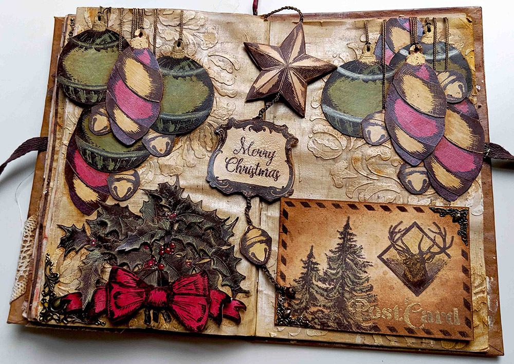
Hi everyone! Now that Halloween is gone, let’s get some Christmas inspiration! Let me share with you the latest art journal spread I’ve created for the PaperArtsy fortnight Challenge: A Vintage Christmas. I really like creating Art Journals, but I always like to do something special about them. In the previous one I did a lot of fussy cutting and I played with colours that are out of my comfort zone. For this one the special thing is that it doesn’t have a fixed layout, you can change it a bit, it’s more playful! Some elements can be moved and changed around: a magnetic postcard and a double sided bookmark (gold/brown) which features a handmade crocheted chain. Of course, apart from those unusual elements, I used some of the usual suspects too… infusions and some of the new colours of PaperArtsy paints. Video coming too! I hope you like it! Enjoy!
Hola a todos! Ahora que Halloween ya ha pasado, vamos a por inspiración para Navidad! Aquí tenéis mi último Art Journal que he creado para el reto que nos propone PaperArtsy cada dos semanas, este se llama A Vintage Christmas. Me encanta crear Art Journals y siempre me gusta hacer algo especial en cada uno de ellos. En el anterior recorté una infinidad de imágenes y trabajé con una paleta de colores fuera de mi zona de confort y me encantó trabajar en él. Para este Art Journal de hoy, lo especial es que da mucho juego porque he creado elementos que no están fijos, se puede jugar con el diseño y cambiarlo de varias formas. Tiene una Postal magnetizada y una especie de punto de libro con elementos de dobles caras (doradas y marrones) que cuelga de una cadeneta de ganchillo que he hecho a mano. A parte de usar estos elementos, como no, usaré mis queridas Infusions y algunas pinturas nuevas de PaperArtsy. Y lo grabé todo en vídeo… 😉 Espero que os guste!
En castellano por aquí / Spanish here
I always add colour using infusions on a white surface. Well, this time, I did it differently, I created 3 coloured papers using these paints: Toad Hall, Sand and Blood Orange.
Instead of painting the smoothy heavy card stock directly, I watered down the paint and I spread it using the black side of a cut’n’dry foam (Mark and Leandra’s tip to use less paint). This gave me a nice and soft background, lighter than the actual paint and perfect as a base for stamping.

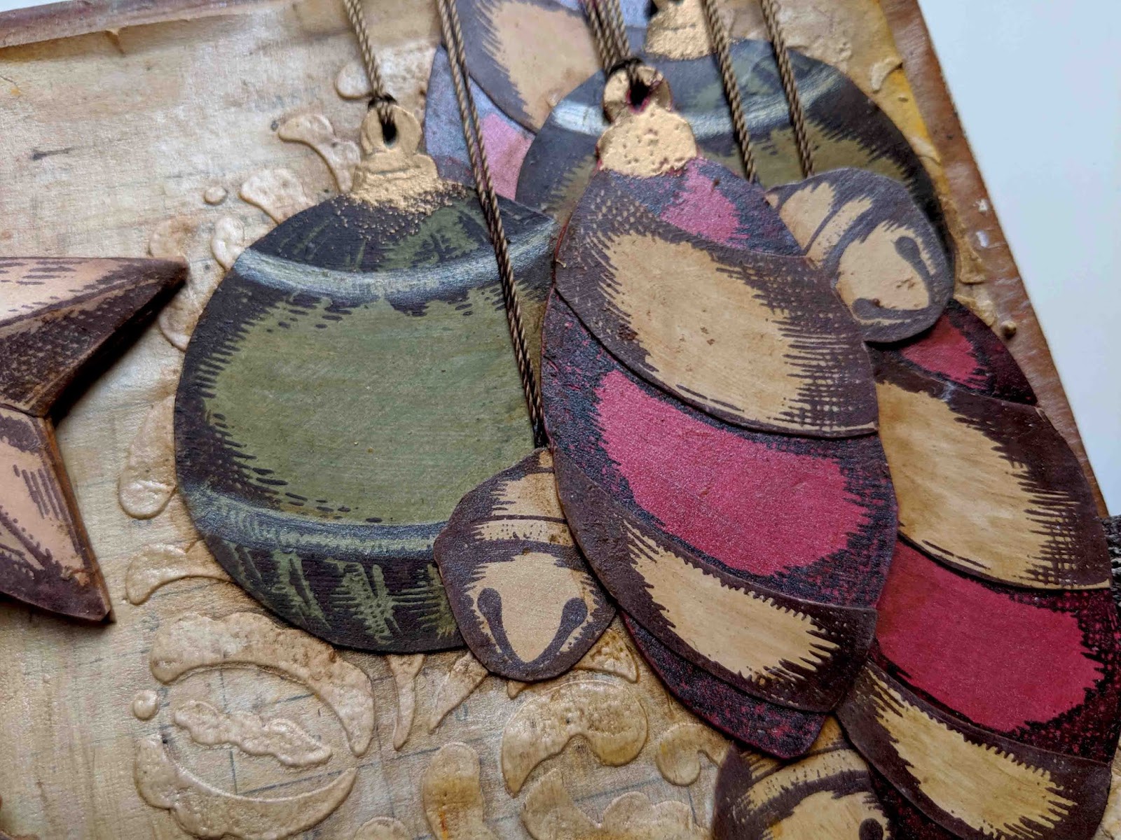
I stamped the vintage ornaments of my stamp set ESC08 and I embossed some parts in gold using WOW embossing powder Pale Gold superfine detail as you will see…

…which I then vintaged using some Infusions: Golden Sands in some parts and also mixed with Pearl Glaze in others, to add some shine. I also used Pearl Glaze with Infusions Sunset Beach to change a bit the red of the hangings and giving them more texture. And some Infusions Olive Tree on the green hangings, for more texture as well. You can see the “vintaged & shined” elements at the right end of the picture vs the “just painted” versions on the left.

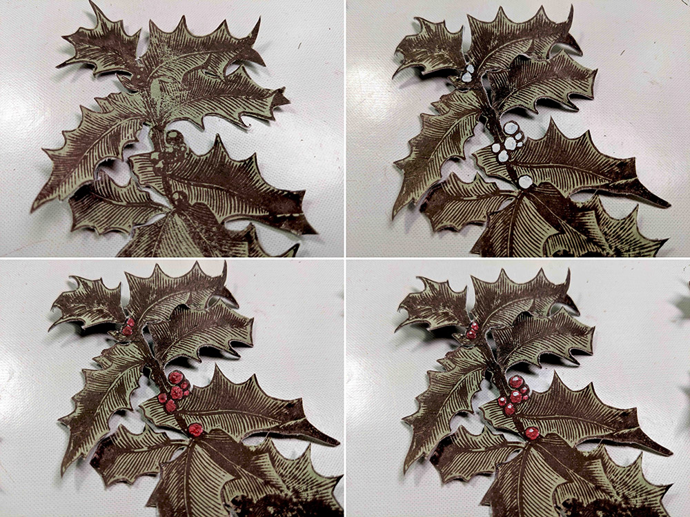
I stamped as well the holly branch of ESC07 thrice on the Toad Hall Fresco Paint painted surface and I fussy cut all three…

Then I painted my berries in red. Since Blood Orange is a translucent paint, I had to paint them white first using the new Cloud 9 paint. With a white surface, the translucent red will show as a proper red, otherwise it would show brownish. This is a trick I’ve seen Leandra using a lot but I had never used it before (I will definitely try it again! #gettingbraverwithpaints).
These are the steps to get the red to the berries: first white with Cloud 9, then red with Blood Orange, then hint of white Cloud 9 to add a reflection and voila! I’m very proud of my first berries, as you can tell by now, hehe 😀 I perhaps could have added some glossy accents on top to make them pop and shine more, but well, next time…
Then I created my background page, I stencilled PS072 in several parts using Grunge Paste

And then using first the Fresco paints Cloud 9 and Sand I created a first layer, as you can see on the left page. Then for my next layer (see right page) I went and added some Infusions Golden Sands combined with some Pearl Glaze which I’m using for the first time and I’m in love with its shine! I added the glaze in vertical and horizontal brushstrokes, dragging the walnut crystals so you get in some spots like a linen effect (One of the first tips Leandra taught us at the first make and take when Infusions went out!). It works better with Matte or Satin glaze, but I just love the shine of the Pearl…

Final layer, more Infusions Golden Sands spritzed with water here and there and the background is ready for me. What do you think? Is it Vintage-Christmas like enough?

And now let’s see how I created other elements… For my bookmark I used one of the Vintage Frames in ESC09

I stamped it and cut it twice. I left one in brown and added some distress rock candy crackle paint on top to get those crackles…
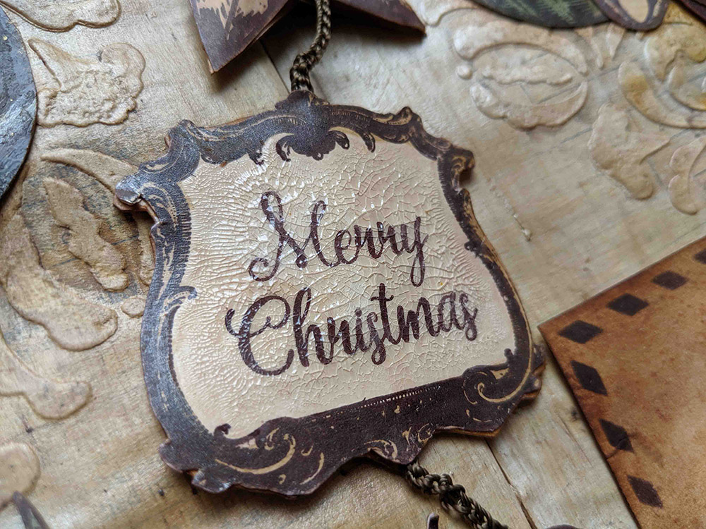
And the one in gold is same process, with just an extra step in the middle: embossing the ink with WOW embossing powder Pale Gold Superfine

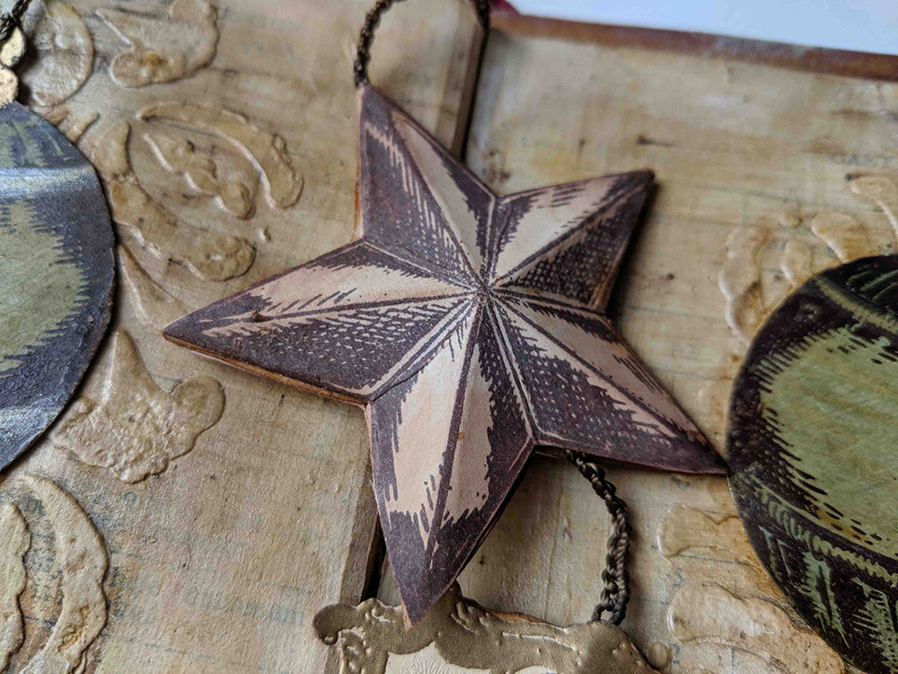
I used the star in ESC08 to do the same, one star in brown and one in gold. I gave each piece some shape so I created a 3D element. I did this technique in the past in this post from 2 years ago, where I went crazy and created a zillion of stars for topic 14 (glitter) of 2017…
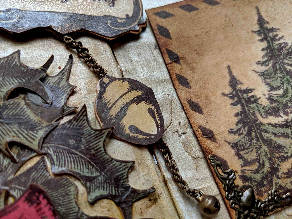
My final element in the bookmark is the jingle bell which again I did one side in brown and the other one in gold. The chain you see is my usual thread to sew metallic elements that seems gold or bronze, but this time I decided to perform the only crochet technique I know: a basic chain. You won’t learn anything more from me on crochet and the chain is not perfect… Crochet is not my strength, but when I was a child, I loved to do jewellery and one summer I did lots of bracelets of this sort, so it came handy and I thought it would be a nice touch since it would match the thread used for my hangings too and it would have more volume than just a piece of thread. I hanged a real and tiny jingle bell from the end of the chain
Now I can show you the golden side of these elements together, although you can twist them and show whichever side of each you prefer (I like the combination golden star, brown frame and golden jingle bell, although my heart is divided and I also love to see them all in brown… What would be your preferred combo?)

And since one Art Journal Spread full of fussy cutting was not enough work for me… I decided to create a postcard on top of everything else… and my heart was divided on where to put the PostCard sign, I originally designed this stencil PS065 so the PostCard could be on the back of an actual postcard…

…but then in an art journal spread I wouldn’t just glue the back of an empty postcard, right? It would be too boring… and I would miss the chance of actually designing the front of the card… It was a big dilema for me, which side to pick… so I solved it with magnets (super strong flat ones) and metallic corner embellishments! The postcard is temporarily secured in place, until you lift it. It will not fall and it’s not glued. This is because the metallic corners have some iron (or are attracted by magnets) so by adding some magnets in the page behind (secured with cell tape) I ensure my postcard will stay in place. Since my journal is made of book pages which are too thin, I anyway end up gluing 2 pages together for more stiffness and to hide stitches etc, so magnets could hide there too, in between pages. So now I have the front as a default setting, where I stamped some ESC07 images and added colour with Infusions Golden Sands and Olive Tree mixed with Satin Glaze. To finish up I added some Vintage Photo regular ink on the edges of the card and with Versafine Clair ink (Pinecone) I stencilled the frame and the PostCard wording of PS065:
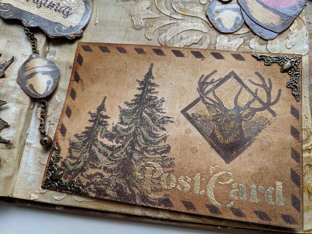
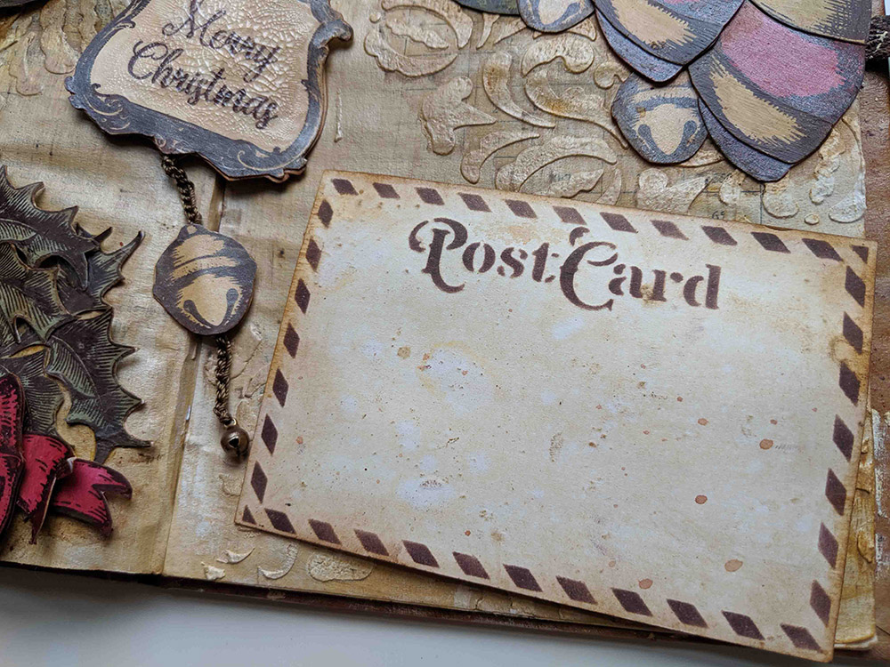
If you lift the card, then you can see the back, where I did the design I had in mind. I can write something on it when I’m ready to do it… Or I could send it away and leave the art journal empty on that side
Then it was time to assemble the fixed 3 clusters. This is the top left one, with 3 green hanging decorations, 2 red ones and 3 jingle bells

Depending on how the light comes, you can see the Pearl Glaze shining. I added some shadow using Distress Crayons Vintage Photo

On the other side we have another cluster of hangings, this time 3 in red and 2 green, also 3 jingle bells. so I would get some balance between the 2 clusters
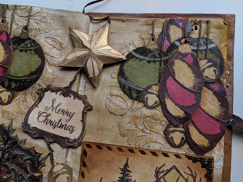
They are “hanging” from the same thread as the crocheted chain and the thread is secured against the back of the page with cell tape. Then the 2 pages will be glued together and threads will be hidden for good.
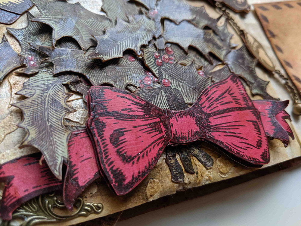
The final corner to explore is the holly one, bottom left. I added a metallic embellishment on the corner (I used distress collage medium, my go to glue for metal if I don’t use thread) and I used the 3 stamped images of the holly branch, which I arranged in a bouquet decorated with a ribbon.

You’ve already seen the berries, but I’m so proud of them that there you go, another close up picture (sorry to pester you… hehehe)

I stamped the ribbon (twice) and the banner (once) from ESC08 and reshaped them as below, to get lots of volume
Once all is set in the Art Journal, we can play around a bit and change the configuration with the movable elements. Believe me, it’s really addictive and I ended up with many, many pictures, from different angles, to capture the shine, not capture it, now with golden elements, now in brown, get the card a bit more twisted, etc, etc…

OK, nothing else from me. I hope you liked my art journal page. If you wanted to see how everything came together, here we have the video
I really enjoyed creating this spread and the playfulness I got. And from the supplies point of view, I particularly liked using the paints as a starting point for a coloured background and the shine that the Pearl Glaze gave me. It was a first for me on those 2 things and I’ll definitely try to use them more often. Next in my list is to explore the other glazes: frosted and metallic… I have an idea or two, but that will be in another time.
Thanks for reading until here! You can find me here below
My blog: https://scrapcosy.com
YouTube: https://www.youtube.com/c/scrapcosy
Instagram: https://instagram.com/scrapcosy/
Facebook: https://www.facebook.com/raquel.burilloperez
Etsy: https://www.etsy.com/uk/shop/Scrapcosy
And since I’m with the teaching bug behind my ear and lots of ideas, I’m thinking about arranging a workshop before end of year. Very limited seats would be available. It will either be a pretty special advent calendar (in November, maybe) or a vintage calendar for 2020 (in December). Let me know in the comments if you are interested, so I contact you first and you don’t miss the spot! It will probably be a Monday or a Tuesday at the current venue I’m considering, which is also very special… a farm in the heart of London! Need to speak with them first though… I will keep you posted if you want!
I hope you liked it! Thanks for reading! And see you soon! 🙂 If you want to send any comments or subscribe, go to the end of the post below
A VINTAGE CHRISTMAS – ART JOURNAL
Intro en castellanoNormalmente siempre añado color usando infusiones en un papel blanco. Esta vez lo he hecho diferente y he creado tres papeles de colores usando pinturas y luego las he usado como base para estampar. He usado: Toad Hall, Sand y Blood Orange.
En lugar de pintar directamente con la pintura el papel smoothy heavy card stock he añadido agua a la pintura para hacerla más diluida y la extendido con la parte negra de la esponja cut’n’dry foam. Es una técnica que me explicaron Mark y Leandra para utilizar menos pintura.
Con esta técnica consigo un fondo más ligero qué usando pintura directamente.
Ahora ya podía estampar mis bolas con el set de sellos de Navidad ESC08 y aproveché para hacer un embossing en dorado de la parte superior de las bolas con los polvos de embossing WOW, Pale Gold superfine detail
Para añadir un toque más vintage utilice Infusions Golden Sands en algunas partes y en otras las mezclé con el barniz perlado Pearl Glaze para añadir un poco de brillo. En otras partes utilicé Infusions Sunset Beach e Infusions Olive Tree . En esta foto podéis ver que los elementos a la izquierda están sencillamente estampados mientras que la derecha podéis ver uno de los elementos tratados con infusiones y con acabado más vintage.
También estampé 3 veces la rama de acebo del set ESC07 sobre la hoja de la pintura verde y recorté las tres para luego hacer un ramillete con ellas.
Como todo el papel es verde tenía que poder pintar mis frutos de color rojo. La pintura roja que utilizo es translucida con lo que pintar directamente sobre verde me daría sólo marrón. Para poder ver el rojo hay que hacer un paso previo y es pintar las bolas de color blanco primero. Esta es una técnica que he visto usar un montón de veces a Leandra pero que yo aún no había utilizado y me encanta cómo han quedado. Los pasos son: pintar las bolas de blanco, luego de rojo y finalments añadir un toque de blanco para los reflejos de luz. Podría haber añadido un toque de glossy accents para hacer las bolas tridimensionales pero bueno lo dejaremos para la próxima vez…
Y ahora a trabajar el fondo con el estencil PS072 y aplicando pasta de textura Grunge Paste en algunos sitios
Con las pinturas cloud 9 y Sand hice una primera capa que podéis ver la parte izquierda de la foto. La siguiente capa es aplicar encima el barniz perlado Pearl Glaze mezclado con infusiones golden sands y la podéis ver en la parte derecha de la foto.
Y la capa final es añadir más infusions golden sands pulverizados con agua en algunas zonas del fondo. Para mí el fondo ya está acabado. Creéis que es suficientemente vintage?
Y ahora vamos a ver cómo creé el resto de elementos. Para el punto del libro utilice uno de los marcos vintage de mi set de sellos ESC09
Lo estampé y lo corté dos veces y añadí la pintura transparente de craquelado distress rock candy crackle paint. En un lo deje marrón…
Y para el otro hice un paso adicional qué es un embossing en dorado (con WOW embossing powder Pale Gold Superfine)
Mismo tratamiento para la estrella del set ESC08, aunque en este caso creé un elemento en 3D. Podéis ver cómo crear este tipo de elementos en este otro post de hace 2 años dónde me volví loca y cree un montón de estrellas con muchos brillos y purpurinas.
El elemento final del punto de libro es un cascabel que hice de la misma forma estampando el marrón y el otro lado un embossing en dorado todo cuelga de una cadeneta de ganchillo que hice con el hilo que normalmente utilizo para coser mis elementos metálicos a mis trabajos al final de la cadeneta colgué un mini cascabel de verdad.
Ahora os enseño el lado dorado del punto de libro. Cada parte se puede girar por separado y tener la configuración que queráis por ejemplo podéis dejar todo dorado o todo marrón o el título dorado y la estrella y el cascabel marrón. Qué configuración os gustaría más?
Y como no tuve suficiente trabajo con recortar todo esto Decidí crear además una postal y quería utilizar mi stencil PS065 que veis más abajo.
Lo diseñe para poder crear la parte de atrás de las postales donde pone un título PostCard y con un margen alrededor, pero claro enseñar esta cara de la postal en un art journal quizás era un poco aburrido. Y me perdía la posibilidad de diseñar una postal. Así que resolví el problema con imanes. La postal tiene dos lados y queda sujeta temporalmente al diseño con imanes por qué incluir unas esquineras metálicas a la que se enganchan. Los imanes los enganché con celo a la parte de atrás de la hoja en el sitio adecuado y las esquineras situadas arriba ya bajo a derecha e izquierda hacen que la postal se quede en su sitio hasta que la levantas para ver qué hay detrás.
Así puedo dejar la postal sin escribir o escrita y que forma parte del diseño o retirarla y cambiarla por otra.
Y ahora os enseño las esquinas fijas que hice con bolas navideñas y con cascabeles. La de la izquierda tiene 2 bolas verdes y 2 rojas y tres cascabeles
Dependiendo de cómo delegar la luz podéis ver el efecto del barniz perlado Pearl Glaze
La de la derecha tiene 3 rojas y 2 verdes y 3 cascabeles más de esta forma las dos esquinas quedan equilibradas.
Todas las bolas cuelgan del mismo hilo que he usado para crear la cadena de ganchillo así queda todo el diseño unificado
La última esquina es la de la rama de acebo he hecho un ramillete con las 3 estampaciones y las he unido con un lazo que he creado estampando el banner y el lazo del set de sellos anterior.
Ya habéis visto como habían quedado las bolas antes pero me gustan tanto que os enseño un detalle más.
Y aquí podéis ver en más detalle el lazo qué tuneado el diseño original cortando y pegando para crear más volumen.
Una vez todo está listo podemos empezar a jugar un poco con el diseño. Estas son algunas de las distintas combinaciones, con y sin postal, con y sin punto de libro, en dorado, en marrón, etc.
Esto es todo por ahí espero que os haya gustado y aquí tenéis el vídeo
Me lo he pasado muy bien creando este art journal y el hecho de poder jugar con el diseño una vez acabado.
Si queréis saber más de mí, me podéis encontrar en todas estas redes sociales:
Mi blog: https://scrapcosy.com
YouTube: https://www.youtube.com/c/scrapcosy
Instagram: https://instagram.com/scrapcosy/
Facebook: https://www.facebook.com/raquel.burilloperez
Etsy: https://www.etsy.com/uk/shop/Scrapcosy
Y como me apetecía mucho enseñar y tengo un montón de idea, he pensado en dar un taller antes de fin de año. Las plazas serán muy limitadas y será aquí en Londres. Seguramente hagamos un calendario de adviento si lo hacemos en noviembre o un calendario normal si lo hacemos en diciembre. Ya me diréis en los comentarios que os parece la idea y os quisierais apuntar a venir a verme aquí 😛
