

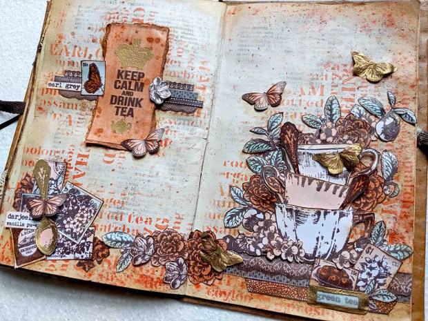
Hi everyone! Today I’m covering the current topic at PaperArtsy blog challenge which is Coral. I decided to create this art journal spread inspired by my tea set collection and the coral colour. I used very simple techniques, not many steps, but very time consuming… The result is a vintage tea garden full of details achieved with minimal art supplies (in terms of colour), but lots of stamps… I couldn’t help but use my entire tea stamp set collection! Get a cup of tea and enjoy the video, the images and all! I hope you like it!
Hola a todos! Hoy os traigo inspiración para reto que propone PaperArtsy esta quincena: Coral! He decido crear este Art Journal inspirado por mi colección de sellos de té y el color coral. He usado técnicas sencillas, no son muchos pasos, pero son muy laboriosos… El resultado es un Jardín de té vintage lleno de detalles realizado con muy pocos materiales (en cuanto a color) pero con muchos sellos… la colección entera! Preparaos una taza de té y a disfrutar del vídeo, las fotos y demás! Espero que os guste!
En castellano por aquí / Spanish here
As you may know, I love to add colour with infusions, so these will be the main supplies I used, but not the only ones. I wanted to add a touch of paint as well, so I couldn’t resist to use one of the new colours recently released which perfectly matches with my colour palette. Can you find out which one it is? Let’s see first the result, then the video and finally all details and pictures.
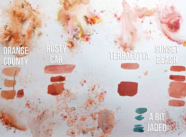
Since the topic was coral, it was only natural that I would explore the 24 colours of infusions and I would select the one which resembled more the living coral (Pantone colour of the year 2019). I may be wrong, but my selected colour was Orange County, a colour that to be honest I had never used before, since among the shortlist were 2 of my all time favourites Rusty Car and Sunset Beach, but this time I decided to set those apart. Terracotta was also very promising, I’ll come back to it in the future too. And to add some contrast I went and chose again a colour that it’s not in my preferred list at all but I know in Spain this colour is killing it! Is A Bit Jaded a favourite of yours as well?
And since I love metallics, I thought that WOW embossing powder in gold (Metallic Gold Rich Pale – superfine detail) would be a nice touch to add here and there. So this became my basic palette.
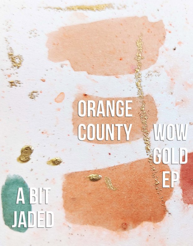
In addition to Infusions I also used these 2 paints: Chalk Fresco Acrylic Paint and the new Cayenne, which perfectly matches Orange County.
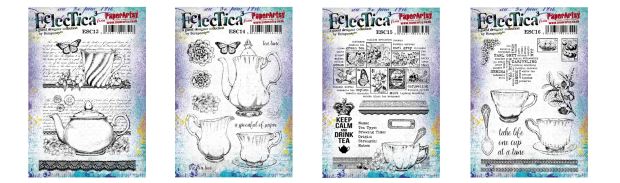
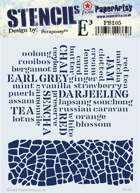
I selected all these stamps ESC13, ESC14, ESC15 and ESC16. I was particularly interested in all flowers, laces, cups and postage stamps from the collection, as you will see
And I selected the stencil PS105 as well
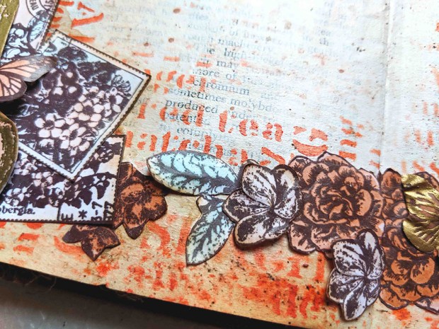
Let’s talk about the background first. These are the layers: first layer is Chalk Fresco Acrylic Paint, added to cover the book pages, but still leave a hint of the letters behind. Next layer is sprinkles of Orange County Infusions spritzed with water. If you see, the edges of the page (porous surface, since I added less paint) have richer colour and more spots than the rest of the page (which is more non-porous). Then using the Tea cloud stamp from ESC16 “inked up” with leftovers of wet infusions in my craftsheet I stamped all over the page. In this case it’s a very subtle result which can be only spot on left bottom of the picture below. Depending on the amount of water and infusions you use (how wet the stamp is and how much colour there is on it) you’ll get different results. Then, using a brush to get more dirty water from my craftsheet I did some splashes. Please note, if there is no leftover of dirty gorgeous infused water in your craftsheet at any of the 2 previous points above, just create it on purpose! And once all Infusions layers are done, we go back to the paint and use Cayenne under the 3 clusters I created for the spread. I just used a stencil brush to apply it before I stick anything on the page
My next step was stamping all flowers, laces, cups and postage stamps from my tea stamp sets below on Smoothy Card stock using VersaFine Clair Pinecone ink (waterproof ink), then watercolour with Infusions Orange County and a Bit Jaded and once all was dry fussy cut the lot. Gosh! Cutting all that took me AGES!! I also stamped (same ink) and embossed with WOW Embossing Powder some elements in vellum and in regular smoothy

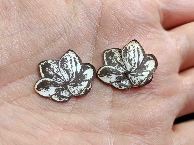
At this point all those little pieces are nice and flat and clean. If you ask me, they are too flat and too clean for me, so now it’s when I add my vintage touch with regular distress ink (Tea dye, another new for me) and some well needed volume using my fingers and nails and the back of some brushes. Here you can (hopefully) see an example of the 3D added to the little flower in ESC14 (I bet many people missed that this flower exists on that set. There are 11 individual elements in ESC14… yes, 11! And Leandra and her elves must hate me for including all those pieces that they manually cut when they produce their stamps… (sorry guys!!) I bet now many of you will go up the post and have a second look at the picture of the stamp set :P)
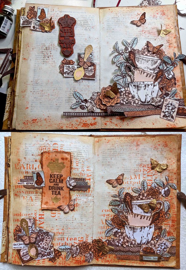
Once all is ready, it’s time to play to get the pieces to their final spots, but of course, I don’t have a design for the spread 100% clear in my mind, I just had a rough idea of having a sentiment on the left page (Keep Calm and drink tea) surrounded by some elements and then having the bottom right corner full of detail and climbing up and left the spread. I also wanted to preserve some “white space” areas. So you can see the original first arrangement and how, after many hours and few days later, it ended up.
After all those hours spent arranging and re-arranging I felt like a florist moving all the flowers and cups and butterflies until I found the perfect arrangement, at least from my point of view. And also have in mind that I didn’t want to cut more pieces (enough scissors for a while!), so I had to almost do magic with just 3 stamped tea plants of ESC16 to get all those green leaves in my composition. I may have chopped one of those plants in 4 parts or more…
The little paper pieces were moving so much (they are slippery!) while arranging them that I built up each cluster using cell tape on the back of the elements, adding one thing after the other, to keep them in place. So basically formed three clusters. Here is the title one. I originally wanted to stamp on the page but somehow I thought it may look too boring so I decided to highlight it somehow. It kind of ended up in a cross shape with all little bits and pieces of lace and some leftover flowers stamps and a butterfly
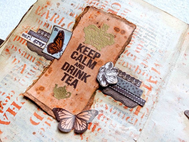
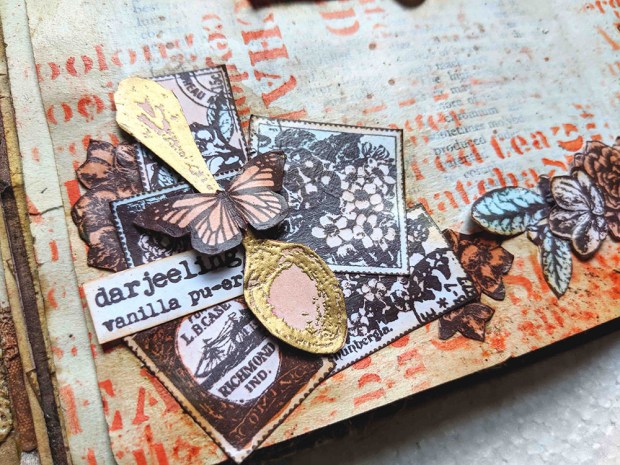
Here is the left corner cluster. I love the postage stamp cloud in ESC15. It’s a fantastic piece to create your own ephemera. And all the tea words around it can be used for different purposes as you’ll see in the different clusters (they’ve become a lace, see title above, a word below and part of a label, three pictures below)
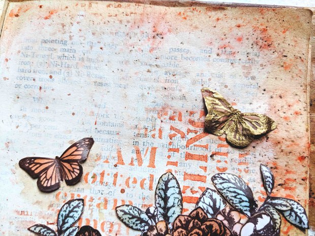
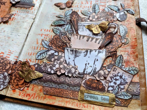
And the huge cluster. Here is the top part of it where I left some butterflies flying around

And the bottom part, maybe one of my favourite sections of the spread, with that label in vellum and all the tiny leaves arranged with the postage stamps and the laces

I glued everything mainly with modpodge and I gave both pages a layer of it on top which then allowed me to work with distress crayons for the first time… I used the Vintage Photo one. I also used the Vintage Photo distress ink, so between the 2 supplies I managed to get some shadowing around the elements in the page
I also used some foam adhesive to create 3D effect in the butterflies as well as in the cups. Check the result in the picture below. By the way, when I designed this tea collection of stamps I had in mind that I wanted to create a pile of cups and I love I finally decided to give it a go and how this tower of cups turned out, with spoons coming out from different directions
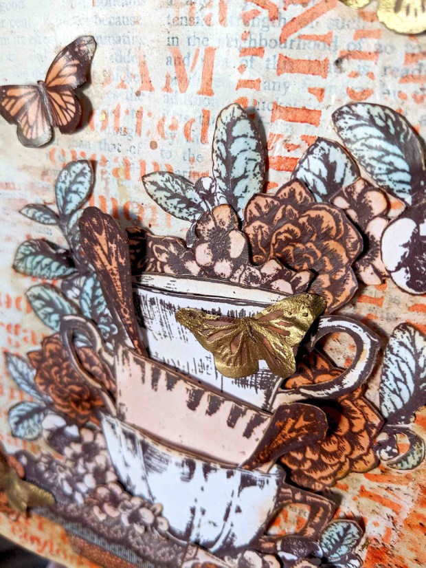
Just a final picture from me, showing more 3D goodness which I love

And if you want to see more, here is the link to the video
I really had fun creating this spread. It was a hard work with scissors and a harder work to decide the final arrangement but I’m very pleased with the result and I can’t wait to do more fussy cutting in the future. I love how collaging all bits and pieces give you the flexibility to not commit to a final stamped image on the page and let you play freely with your design until you’re 100% convinced. I specially loved to chop and re-purpose different parts of a stamped image (like the tea plant or some of the laces) and see what they become in the final design. There is no right or wrong on how you arrange the items in the collage, so as long as you enjoy the playfulness of it, it’s worth to spend the time.
That was all for today, thanks so much for spending your time in this maybe-too-long post, but I’ve been out for a while with my baby and all, and I may have come back too energetic on my typing and my sharing of pictures… I hope I didn’t get you bored too much, hehe. See you around! And until the next one!
My blog: https://scrapcosy.com
YouTube: https://www.youtube.com/c/scrapcosy
Instagram: https://instagram.com/scrapcosy/
Facebook: https://www.facebook.com/raquel.burilloperez
Etsy: https://www.etsy.com/uk/shop/Scrapcosy
I hope you liked it! Thanks for reading! And see you soon! 🙂 If you want to send any comments or subscribe, go to the end of the post below
Coral Art Journal Spread
Como sabéis, me encanta usar las Infusions, así que serán mi fuente de color principal para este diseño, pero también usaré una de las nuevas pinturas que ha sacado PaperArtsy recientemente.
Este es el vídeo, por si queréis empezar por aquí:
Después de revisar los 24 colores de infusions y ver cuál se parecía más al living coral (Pantone del 2019) elegí Orange County, aunque mis favoritos sean Rusty Car y Sunset Beach. Terracotta también es muy chulo, en otra ocasión quién sabe… Para contrastar opté por A Bit Jaded, un color nunca uso pero que vuelve loca a la gente de España. Qué os parece ese turquesa?
Y el oro no podía faltar, he usado WOW embossing powder gold (Metallic Gold Rich Pale – superfine detail). Esta es mi paleta pues (más las pinturas Chalk y Cayenne):
Usé estos sellos ESC13, ESC14, ESC15 y ESC16. Sobretodo me interesaban las flores, las puntillas, las tazas y los sellos postales
Y este estencil PS105
Este es el fondo que creé, primera capa de Chalk Fresco Acrylic Paint para cubrir el libro, luego infusions Orange County de varia formas y finalmente la pintura Cayenne bajo las 3 composiciones
Estampé todas las imágenes en Papel Smoothy con tinta VersaFine Clair Pinecone (resistente al agua), pinté con agua e Infusions Orange County y A Bit Jaded y una vez estuvo todo seco, a cortar… se me hizo eterno!! También hice embossing con polvos WOW en dorado sobre papel vegetal (mariposas) y sobre el mismo Smoothy (cuchara)
Y ahora toque vintage con tinta distress ink (Tea dye) y a darle volumen con los dedos. Se nota la diferencia entre las dos flores?
Y ahora a jugar con las piezas… y de un plan inicial, después de mucho jugar, empiezas con un diseño (arriba) y acabas con otro (abajo)
Me sentí como una florista, colocando flores por todas partes para crear ese ramillete de flores y tazas. Las hojas vienen de 3 estampaciones, no quería cortar más asií que tuve que hacer maravillas y separar una planta en 4 trozos o más para tener muchas partes verdes por todas partes…
Hice mis tres agrupaciones y las pegué por detrás con celo, sino hubiese sido imposible pegarlas con cola directamente… esta es la primera agrupación: el título
la segunda, cuchara con sellos postales y más retales
y el mega clúster, con mariposas saliendo de él. Esta es la parte de arriba
Y la parte de abajo quizás es mi parte favorita de este art journal, con esa etiqueta dorada y las hojitas de té sobre los sellos…
Lo pegué todo con modpodge y usé distress crayons, el Vintage Photo para incluir sombras. También usé un poco de tinta distress normal, la Vintage Photo con el mismo fin de crear sombras.
Un poco de espuma para crear volumen en las tazas… Al diseñar estos sellos tenía pensado que querría hacer algún día un proyecto con unas tazas apiladas, y por fin aquí están!
una foto final con más detalles 3D que me encantan
Y para más diversión, este es el vídeo
Espero que os haya gustado, yo me lo pasé pipa, aunque se me hizo muy largo…
Si queréis saber más de mí, aquí estaré:
Mi blog: https://scrapcosy.com
YouTube: https://www.youtube.com/c/scrapcosy
Instagram: https://instagram.com/scrapcosy/
Facebook: https://www.facebook.com/raquel.burilloperez
Etsy: https://www.etsy.com/uk/shop/Scrapcosy
Hasta la próxima!

Wonderful detail and color! I love it!
LikeLike
Un trabajo excelente como ya nos tienes acostumbrados, inspirado en una de tus pasiones “el té” muchas felicidades!!!
LikeLike