

Hi everyone! Raquel here from scrapcosy. Today I’m bringing you 2 different projects (and therefore, 2 videos) I’ve created for the fortnight challenge that paperartsy is hosting. This time is about reinkers. You would think reinkers just exist to add ink on your wasted ink pads, however, you can do many other things with them. At my end I will show you about 5 different uses and I will use my favourite stamp set by Darcy and one of the new stencils from her latest release. Visit the PaperArtsy blog for more tips and techniques. Enjoy!
Hola a todos! Hoy os traigo dos proyectos diferentes (y por tanto, dos videos) que he creado para el reto vigente de PaperArtsy que va de reinkers (mmm, como traduzco esto… los reinkers son las botellitas que van llenas de tinta para en principio re-entintar los inkpads (uf, otra palabra… los inkpads son as cajitas con espuma o fieltro que tienen tinta y que usamos para entintar nuestros sellos. Hoy estoy espesa, seguro que mañana me salen las palabras correctas). Bueno, pues normalmente pensaríais que los reinkers se usan para eso, para añadir tinta, pero podéis hacer muchas otras cosas con ellos y en el post de hoy os enseño 5 técnicas diferentes. Usare mis sellos favoritos de Darcy y un nuevo stencil que acaba de sacar. Empezamos!


En castellano por aquí / Spanish here
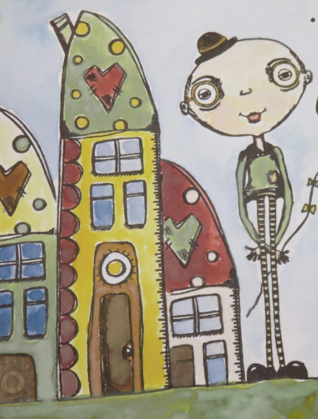
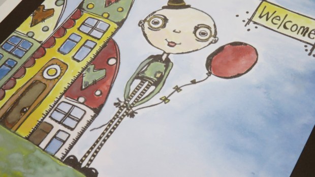
Watercolour – welcome home
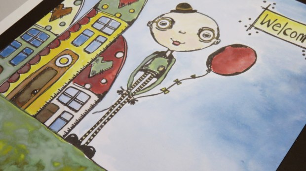
For this technique I decided to use the distress oxide reinkers (mention colours and add For this technique I decided to use the distress oxide reinkers as watercolours. I selected for my palette: fossilized amber, faded jeans, aged mahogany, vintage photo, bundled sage, peeled paint and a touch of picked raspberry). I stamped my images on a 5 by 7 piece of heavy smoothy paper using versaFine Clair fallen leaves, which seem to repel water very well and don’t get as much covered as regular archival or regular versafine. This is my go to ink when it comes to this technique. I used my PaperArtsy white craft mat as a palette and I put a tiny drop of each one of the inks on it, then with a waterbrush (or a brush dipped into water) I added water to the drop, and I started colouring my stamped composition. I used the stamp set EDY21 by Darcy.
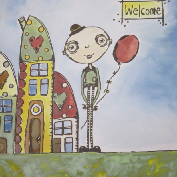
I did some masking to create a little neighbourhood out of just one house (I love that house!!) and I used just 7 colours of ink for the entire piece.
And since my composition was crooked, I decided to attach it to a dark background a bit twisted so the actual floor is flat.
It was a relaxing time, I really enjoyed playing with the reinkers in this way! If you want to see it come to life, here is the video:
Experiments with rats
Then, I decided to experiment a little bit more. I recently bought a vintage photo regular distress reinker for my inkpad, since I was running out of that ink again… It’s my favourite ink to add a final vintage touch on projects. And I also had the Vintage Photo distress oxide reinker. So I decided to use both reinkers (regular and oxide) to create the same project in 2 tiny cards out of smoothy heavy cardstock and compare the results. Regular Distress ink is translucent and Distress Oxide ink is opaque so even if I used the same colour, I thought the results should be a bit different, and I was right. Here is a video with all the details of my experiments, but I’ll also write down the main steps and techniques used.
The first technique was to create my background. I used 2 big drops of Chalk Fresco Paint on my craftsheet, I extended them with a palette knife and added one drop of Vintage Photo Oxide ink on one and regular ink on the other one, I mixed the paint loosely and dragged and touched each piece of card on the corresponding puddle of paint until I got full coverage. I got a pastel look and when dried it with the Heat Tool it surprisingly became pinkish. I didn’t finish there, I added some water on the leftovers of the sheet, picked it again with my card, sprayed on the card some drops and heat set, until I created that typical distressed background full of drops, splashes and all but in a softer version. They got similar colour but the oxide one (left) was lighter in colour.
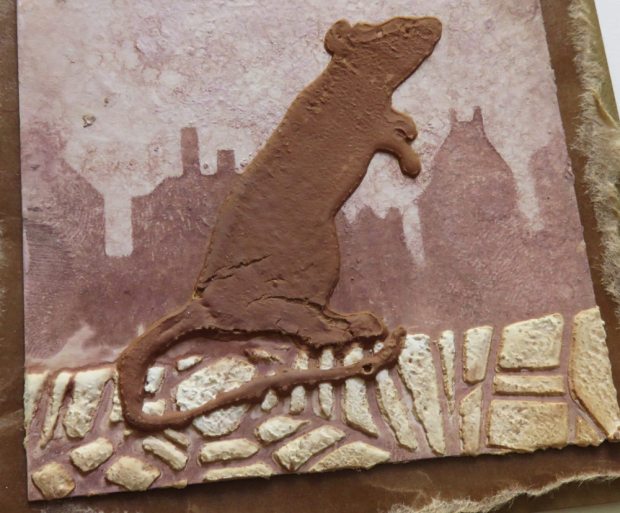
The second technique was to add ink through the stencil. I just put a tiny amount of ink in my craftsheet and lifted/smudge it using a piece of cut-n-dry foam and I added the buildings using Darcy’s new stencil PS115 to my background. I had to headset the ink, since I’m applying a non permanent ink on a non porous surface, so it takes a while to dry. The regular distress is translucent, so I can still see some of that texture (drops etc.) I created (first picture). Distress Oxide (second picture) is opaque so all that texture becomes covered.
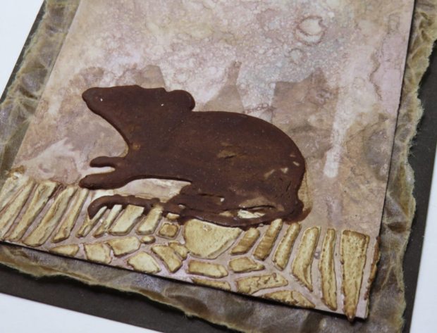

Then I added the floor on my background. For that I used the cobweb part of the stencil (covered with tape to create a flat line) and I used Grunge Paste through the stencil. For my third technique I mixed a drop (2 for the oxide ink, since they are smaller due to the type of applicator tip) with Grunge Paste and stencilled each rat. At first they looked similar in colour but when dry the regular distress rat (first picture) was much darker than the oxide one (second picture). With the leftovers of each sponge I aded some ink on the borders of the card and on top of all the GP areas (floors and rats) to add more texture.
At this point, the 2 cards were very similar but one was significantly lighter (oxides) than the other one (regular) so I decided to bring a quote about light and darkness as a final touch to my little experiments and Alison Bomber’s stamps EAB02 were just the perfect match.

I used the stamp with the quote “If there is light, then there is darkness. Pitagoras” for my final technique. So I got a piece of cut-n-dry felt and I created a mini inkpad of distress oxide vintage photo (regular) to stamp my quote twice on a piece of card. Why I did it twice? Because I wanted half a sentence on one card and half a sentence on the other card AND I wanted my margin to be as wider as I could. If I had just stamped the quote once and had cut it by the middle, the margin I would have got would have been too narrow for my taste. So I cut each sentence from a different stamped quote. And this time I went for the same ink for both cards (regular distress) so there would be something coordinating between them. I finally assembled these on a light brown card (for the oxide sample) and a dark brown card (for the regular one) and I used crunchy waxed kraft paper torn by hand, one flat (oxide) and one crumbled (regular) to create an intermediate layer between the piece and the card base. I decorated each piece with a metallic star.

Thanks very much for reading! I hope you liked the techniques and I encourage you to get your reinkers out and come up with other new techniques. As you see, one colour it’s enough to experiment. And just consider that the ink is a very concentrated liquid paint, so almost anything you do with paint can also probably be done with a reinker.
If you want to stay in touch or see more about me, here are my social media links
YouTube: https://www.youtube.com/c/scrapcosy
Blog: scrapcosy.com
Instagram: https://instagram.com/scrapcosy/
Facebook scrapcosy page: https://www.facebook.com/scrapcosy/
Facebook personal page: https://www.facebook.com/raquel.burilloperez
Etsy: https://www.etsy.com/uk/shop/Scrapcosy
I hope you liked it! Thanks for reading! And see you soon! 🙂 If you want to send any comments or subscribe, go to the end of the post below
Experimentos con ratas y reinkers
Acuarela – welcome home
Al final del post he puesto el vídeo sobre cómo hacer esta pieza y todos los materiales usados, pero para los que os gusta leer o para los que os perdéis mis explicaciones en inglés, os dejo aquí todos los pasos.
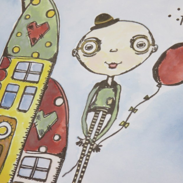
Para esta técnica decidí usar varios reinkers de distress oxides como acuarelas: Faded Jeans, Fossilized Amber, Peeled Paint, Pickled Raspberry, Vintage Photo, Bundled sage, Aged Mahogany. Estampé mis imágenes usando la tinta VersaFine Clair – Hojas muertas (link) que es muy aceitosa y parece que repele el agua muy bien y esto va genial para que la tinta de las distress oxides (opaca) no cubra tanto la imagen que acabo de estampar. Esta es mi tinta favorita para esta técnica. Utilizo mi craft sheet (protector de mesa de teflón) blanco de PaperArtsy como paleta y pongo una gotita de cada tinta en una zona, entonces con un pincel de agua (o si no tenéis, podéis usar un pincel normal mojado en agua) añado agua a la primera gota de tinta y empiezo a colorear my composición.
Hice un poco de masking (cubrir zonas estampadas para volver a estampar a los lados sin estropear la primera estampación) para crear un pequeño vecindario de 3 casas usando un único sello (esta casa me encanta! Es de mi sello favorito de Darcy EDY21) y la coloreé con sólo 7 tintas.
Como mi composición estaba torcida (el suelo apuntaba para arriba), decidí pegarla a otra cartulina y ponerla torcida de forma que el suelo fuese plano. Escogí un color marrón oscuro parecido al de la tinta que usé al estampar los sellos, para que coordinase todo y para que le diera más vida a la pieza
Crear esta acuarela fue muy relajante, la verdad. Me encantó jugar con los reinkers así! Si queréis ver como lo hice todo, aquí está el vídeo:
Experimentos con ratas
Entonces decidí experimentar un poco más. Hace poco me compré mi segundo reinker de tinta Vintage Photo Distress, la normal, que la uso un montón y mi ink pad ya es estaba acabando otra vez. Y por otro lado tengo el mismo color de tinta en la versión oxide. Así que decidí hacer una comparativa entre las dos tintas (normal y oxide) y crear el mismo proyecto usando varias técnicas. La Distress normal es translúcida y la Distress Oxide es opaca, así que en principio, aunque fuesen el mismo color tenían que tener en teoría acabados diferentes, y estuve en lo cierto. Aquí podéis ver el vídeo con mis experimentos y a continuación explicaré todos los pasos:
Corté dos trocitos de cartulina smoothy heavy cardstock de PaperArtsy para aplicar las mismas técnicas en ambas pero usando una tinta en cada lado.
La primera técnica fue crear el fondo. Puse dos gotas gordas de pintura acrílica blanca Fresco Acrylic Paint Chalk en mi mantel de teflon, extendí la pintura con una espátula como si fuese mantequilla en el mantel y puse una gota de tinta encima que volví a extender brevemente sobre la pintura. Entonces cogí el primer trozo de papel y lo pasé/arrastré por esa mezcla hsta cubrirlo todo. Y repetí lo mismo con la otra tinta. Como veis, la distress oxide tiene un acabado más claro que la distress normal.
En la segunda técnica apliqué tinta a través del estencil usando un trozo de espuma y una gotita de tinta. La de Distress normal (primera foto), como es translúcida aún me deja ver parte de la textura que había creado debajo en mi paso anterior, pero la oxide (segunda foto) es opaca y cubre todo el fondo.
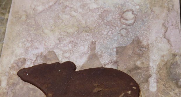
En mi siguientes pasos usé pasta de textura Grunge Paste (GP) a través del estencil para crear el suelo con la tela de araña (tapé una parte con cinta de carrocero para tener una línea recta). Luego usé GP con una gota de cada tinta para cada rata y como veis la distress normal (primera foto) al secar queda bastante más oscura que la distress oxide (segunda foto). Finalmente apliqué un poco de tinta con las espumas que había usado antes para añadir más textura y detalles en los bordes y sobre la pasta de textura del suelo y de las ratas.
En este punto las dos composiciones eran muy similares, pero una más oscura que la otra, así que decidí terminar el experimento usando una frase del set de sellos de Alison Bomber EAB02 que dice: If there is light, then there is darkness. Pitagoras (si hay luz, entonces hay oscuridad. Pitagoras)
Para estampar la frase me creé mi propio inkpad con un trozo de cut-n-dry felt y tinta de la distress normal. Estampé dos veces la frase para recortar una pieza de cada y poder tener el mayor margen posible. Para rematar usé unas estrellas metálicas y monté cada pieza en un trozo de cartulina un poco más grande y de marrón claro para la oxide y marrón oscuro para la normal. Y entre la cartulina y la pieza puse un trozo de papel kraft encerado (crunchy kraft paper) y en el caso de la oxide lo dejé tal cual, pero en el de distress normal lo arrugué para tener más textura.

Muchas gracias por leer. Espero que os haya gustado y que os animéis a sacarle otro partido a vuestros reinkers. A continuación os dejo la lista de materiales que he usado.
Materiales
Sellos EDY21 – https://shop.paperartsy.co.uk/eclectica-darcy-21-7529-p.asp
Sellos EAB02 – https://shop.paperartsy.co.uk/eclectica-alison-bomber-set-02-7201-p.asp
Smoothy heavy – https://shop.paperartsy.co.uk/smoothy-heavyweight-a4-white-stamping-card-pkt-10-4209-p.asp
Tintas Distress Oxides:
- Faded Jeans – https://shop.paperartsy.co.uk/distress-oxide-reinker—faded-jeans-7118-p.asp
- Fossilized Amber – https://shop.paperartsy.co.uk/distress-oxide-reinker—fossilized-amber-7112-p.asp
- Peeled Paint – https://shop.paperartsy.co.uk/distress-oxide-reinker—peeled-paint-7115-p.asp
- Pickled Raspberry – https://shop.paperartsy.co.uk/distress-oxide-reinker—pickled-raspberry-7124-p.asp
- Vintage Photo – https://shop.paperartsy.co.uk/distress-oxide-reinker—vintage-photo-7110-p.asp
- Bundled sage
- Aged Mahogany
Craft Mat – white – https://shop.paperartsy.co.uk/craft-mat—white-651-p.asp
Palette Knife – Espátula – https://shop.paperartsy.co.uk/palette-knife-3-4132-p.asp
Pasta de textura Grunge Paste – https://shop.paperartsy.co.uk/grunge-paste-4129-p.asp
Pintura acrílica blanca Fresco finish chalk – https://shop.paperartsy.co.uk/fresco-finish—chalk-5241-p.asp
Spray bottle – https://shop.paperartsy.co.uk/spray-bottle-30ml-5255-p.asp
Ranger Heat tool – https://shop.paperartsy.co.uk/ranger-heat-gun-3074-p.asp
Cut-n-dry foam – https://shop.paperartsy.co.uk/cut-n-dry-foam-2673-p.asp
Crunchy waxed Kraft paper – https://shop.paperartsy.co.uk/crunchy—waxed-kraft-paper-3454-p.asp
